FRAME
PUblication
Work
Discover / Define
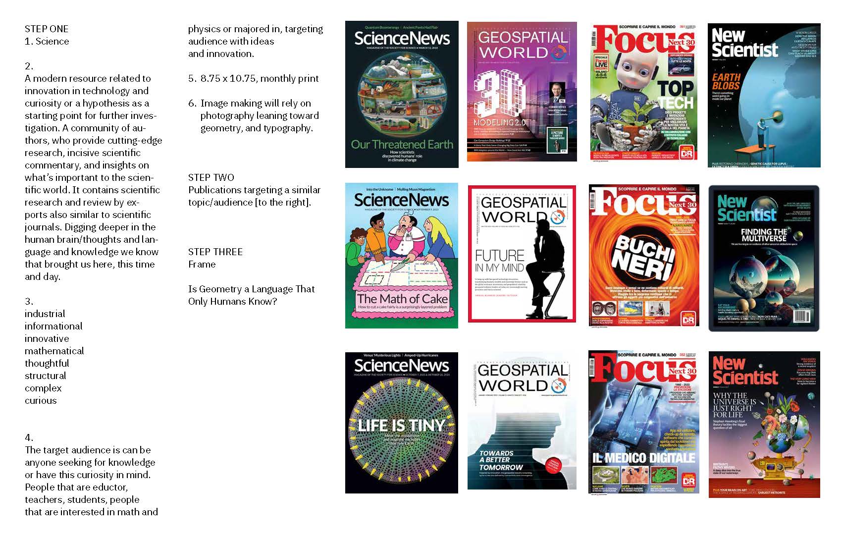
The target audience for this publication includes students, educators, and anyone interested in science, mathematics, and geometry. It is created for people who are curious and eager to learn more about these fields. The publication aims to inspire new ideas and deepen understanding. Whether readers want to improve their teaching, expand their knowledge, or explore new concepts, it serves as a valuable resource. It also builds a community where curiosity is encouraged, knowledge is shared, and readers are motivated to think beyond boundaries.
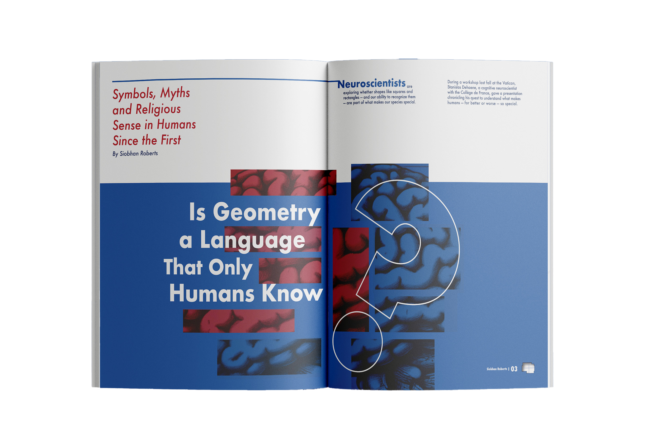
Is Geometry a Language Only Humans Know?
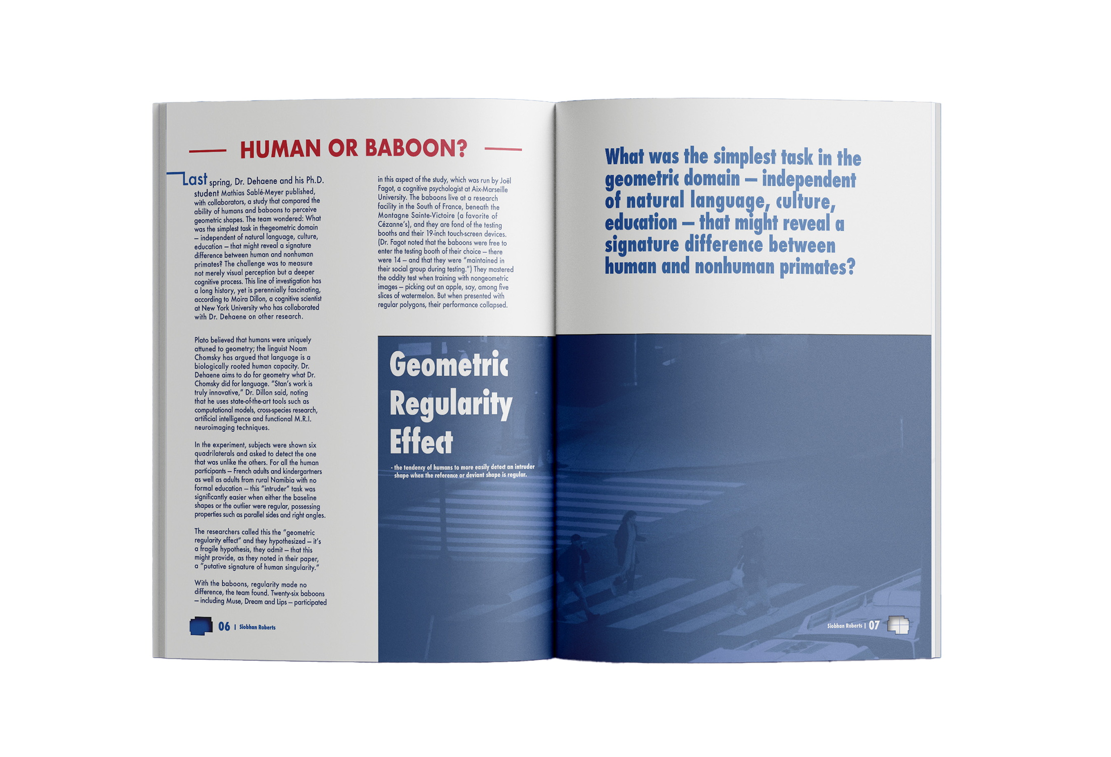
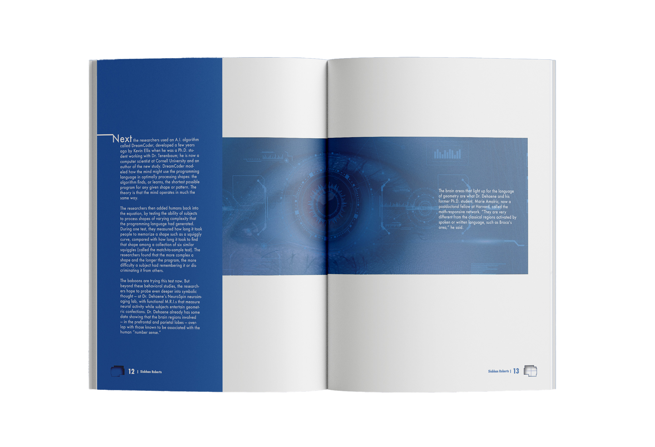
The lead article explores how humans understand geometry differently from other species. It examines research from neuroscientists such as Stanislas Dehaene, who suggest that the human brain may naturally recognize geometric concepts as part of human cognition.
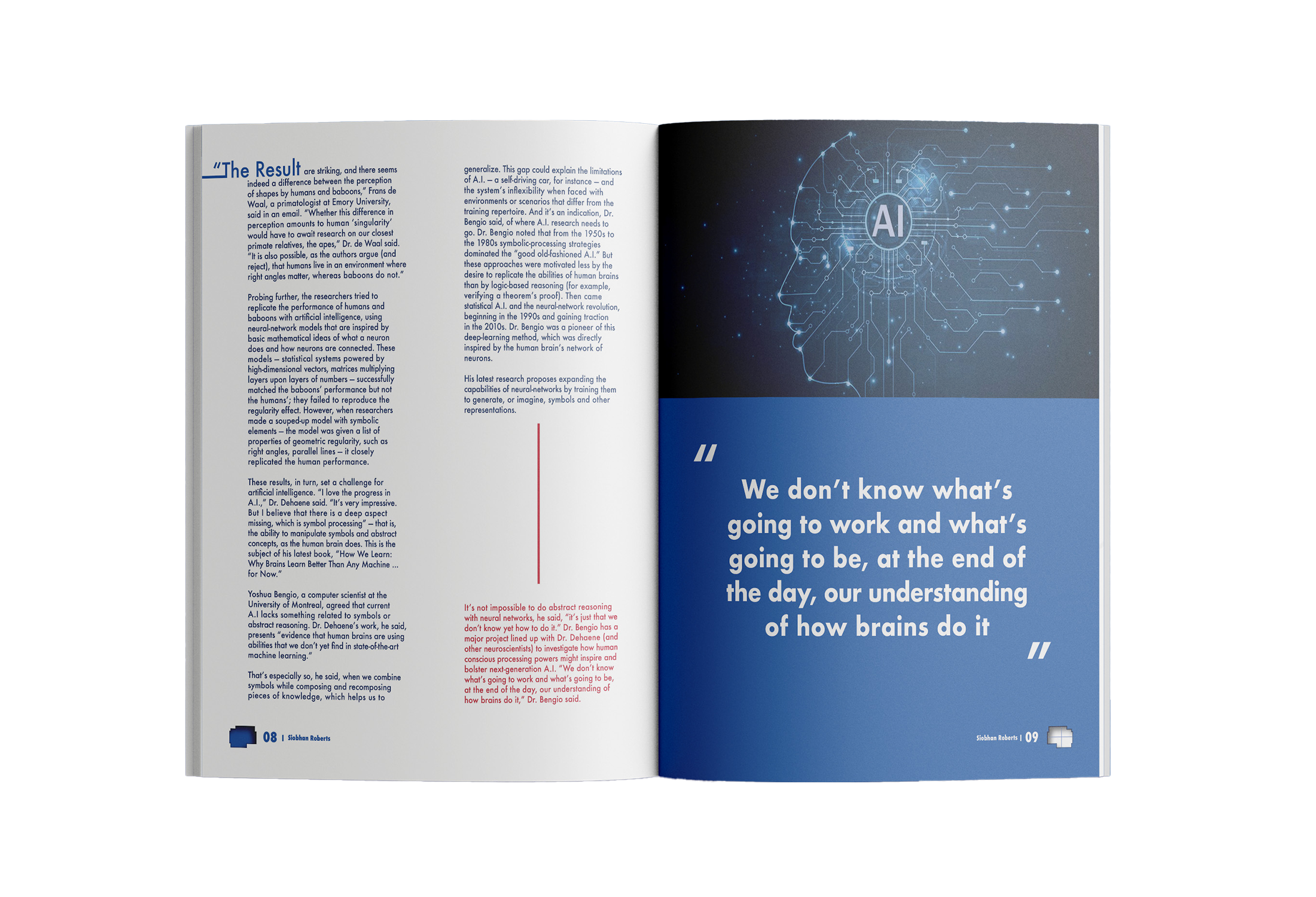
It also discusses experiments with baboons, which showed that although they could recognize simple shapes, they struggled more with regular geometric forms than humans. This difference suggests that humans may have a unique connection to geometry through abstract thinking and symbolic reasoning, abilities that current artificial intelligence still struggles to fully replicate.
Typeface Choice
Futura:
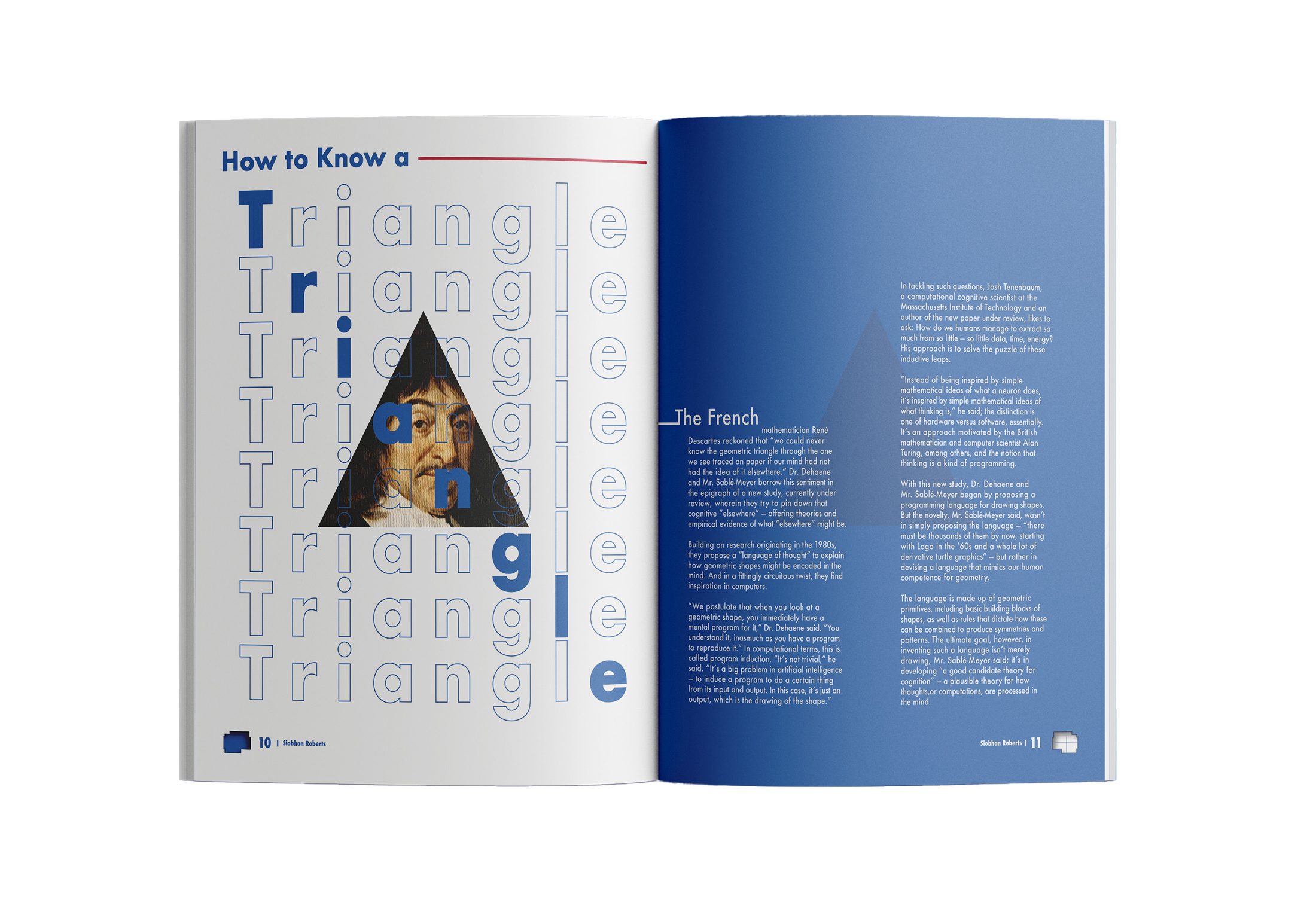
Futura is a geometric sans serif typeface, which its letters are built from simple shapes. This makes it a strong fit for topics like physics and geometry, where form and structure are important. It is clean, easy to read, and has a modern, professional feel, which helps make complex scientific ideas more accessible. Futura also builds trust with readers, especially in educational contexts. Overall, its clarity and geometric style make it a great choice for science publications, helping present information in a clear, engaging, and visually appealing way.
Identity / Deliver
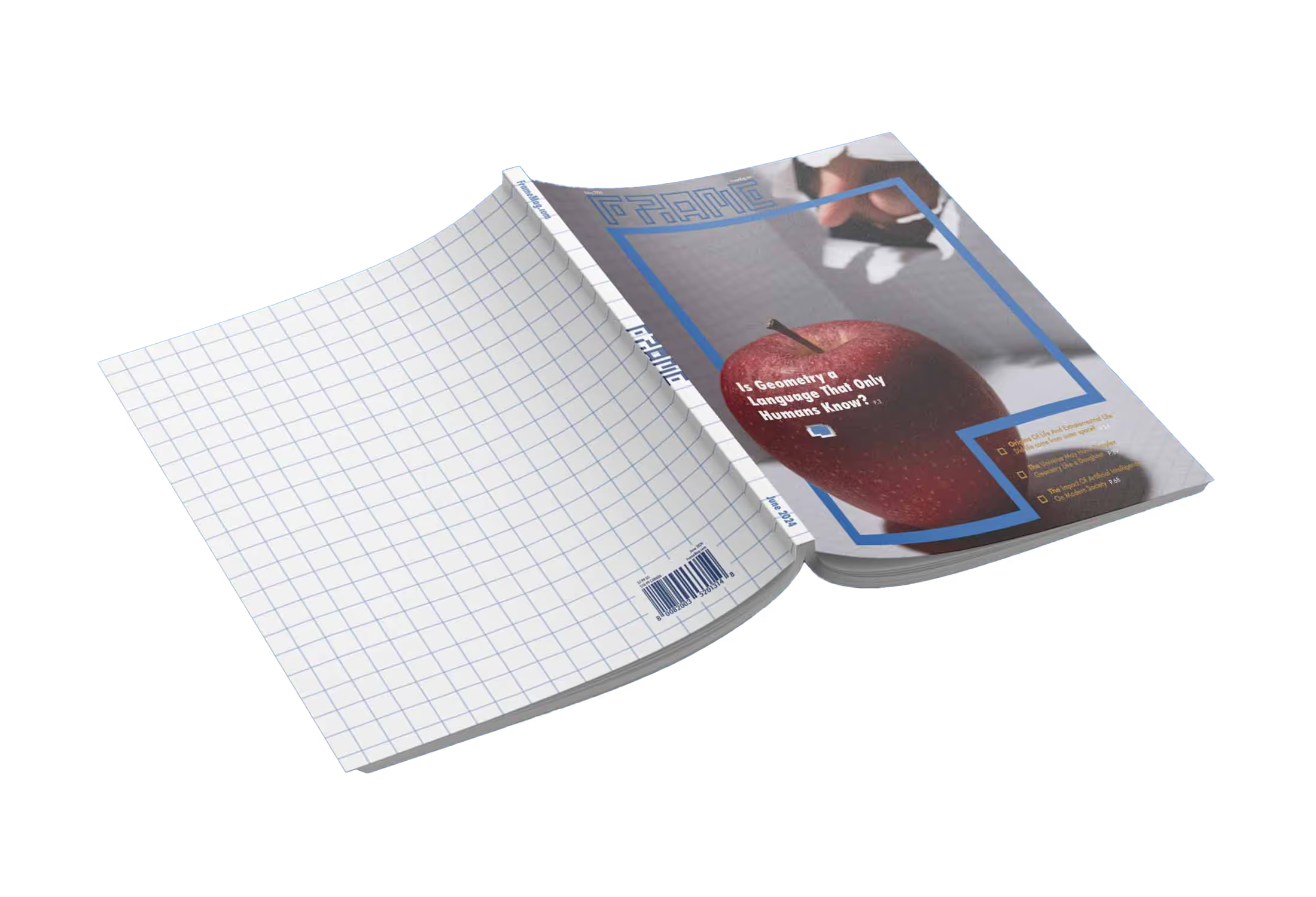
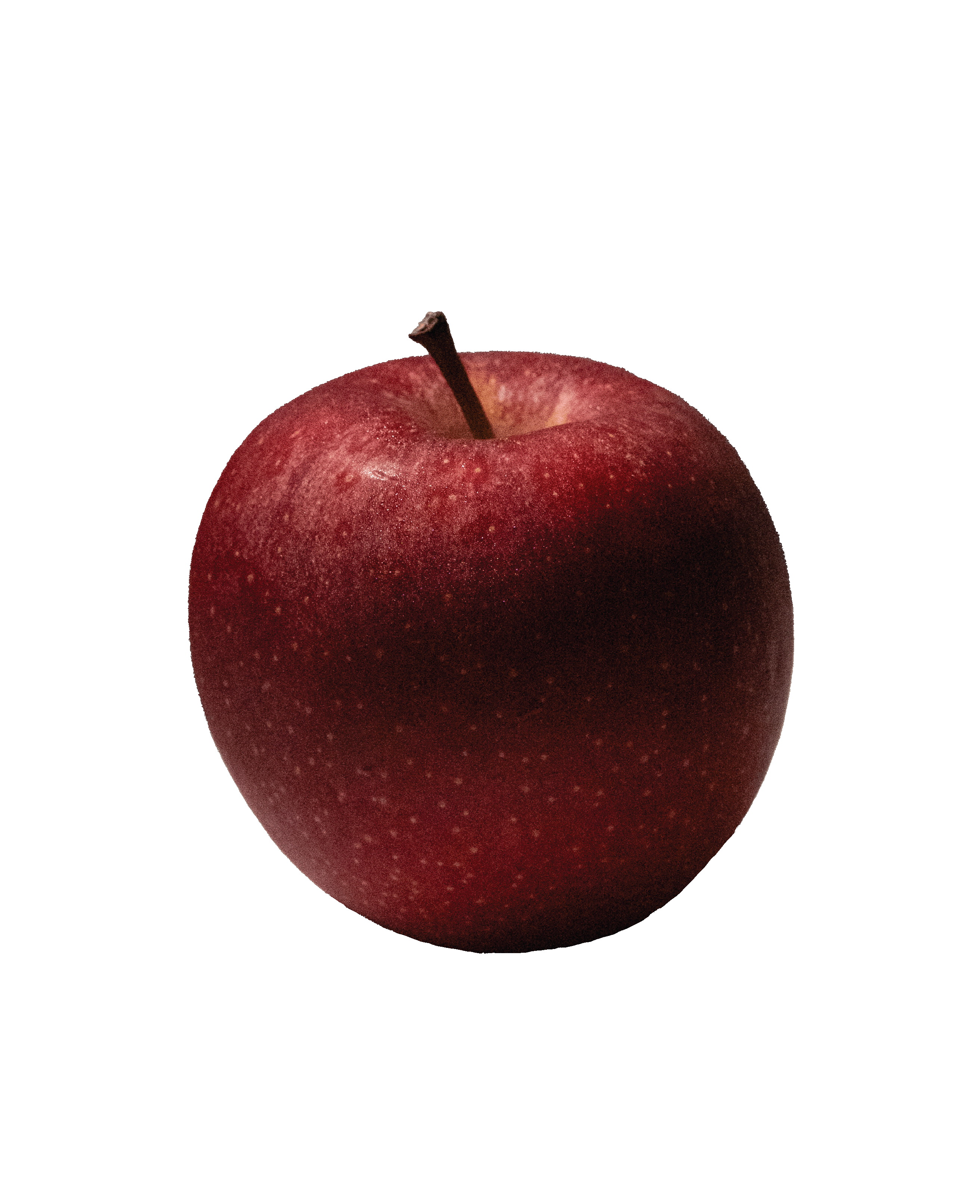
This publication explores science and geometry for students and anyone interested in these fields. The cover features a red apple, symbolizing knowledge, as a hand reaches out to grab it, representing the pursuit of learning. The design moves from breaking a flat 2D grid into a dynamic 3D world, reflecting the growth of human understanding. By the back cover, it returns to a 2D grid, showing how knowledge is a continuous cycle, back to the beginning.
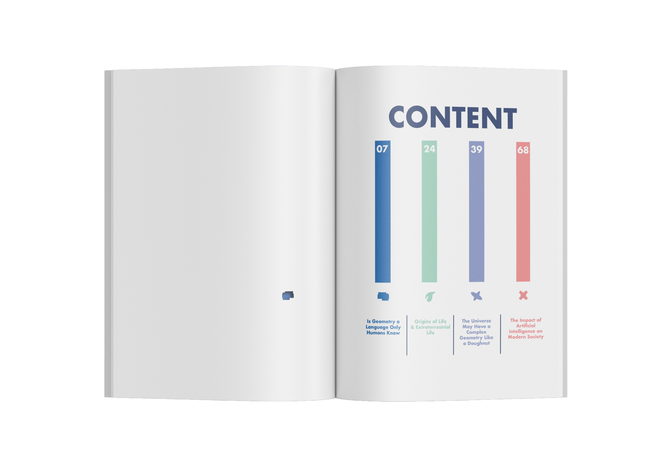
The content examines how humans understand geometry differently from other species and asks what makes human intelligence unique. It also touches on the limits of current AI in handling abstract thinking, offering insight for those interested in technology and the future of learning.
With visual elements like pixelated brain icons and 3D forms, the publication creates an engaging experience, encouraging students to think about their future and explore new possibilities.
Deeper meaning of the Design:
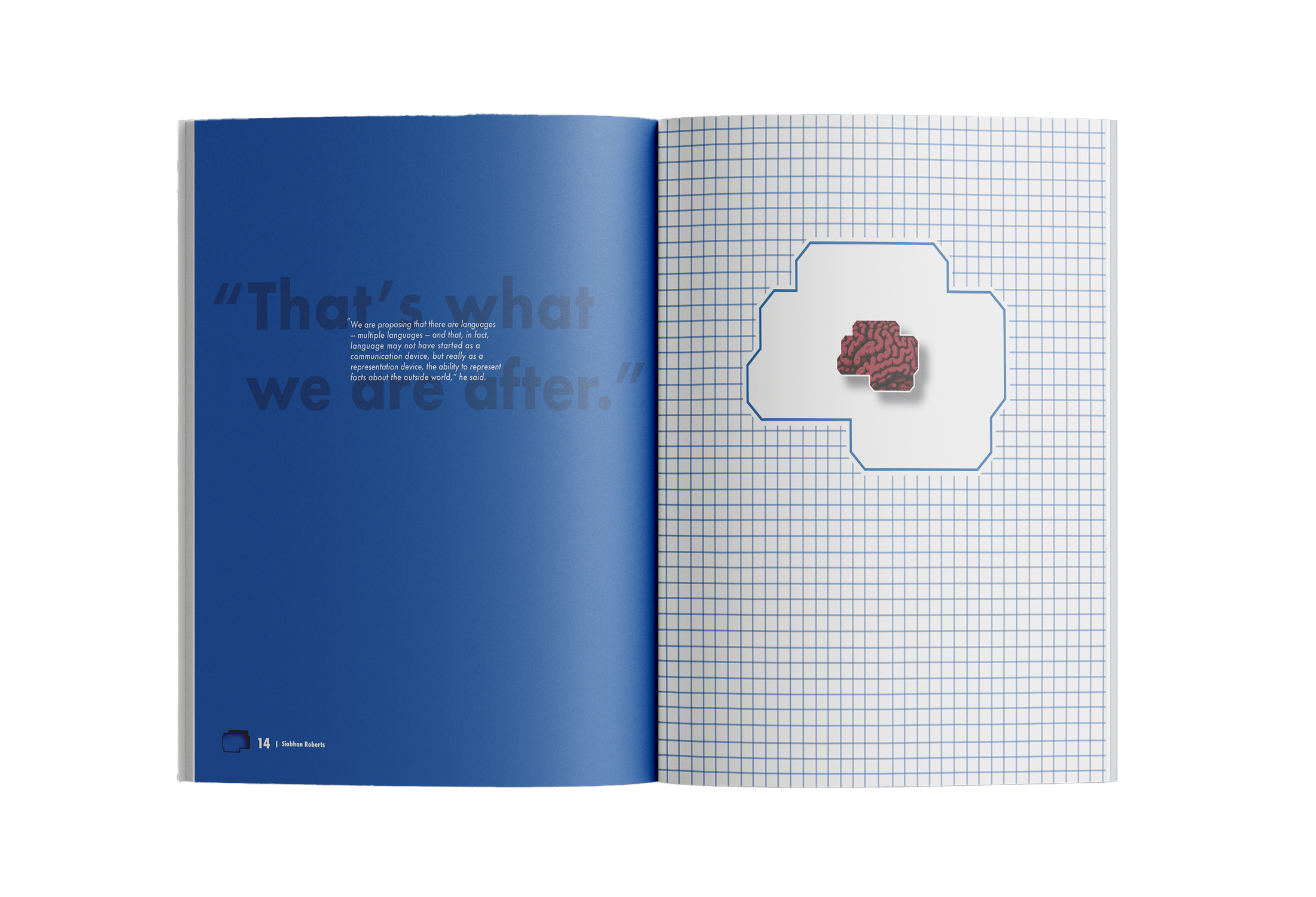
The lead article, “Is Geometry a Language Only Humans Know,” is represented by a pixelated brain icon, symbolizing digital knowledge and human thinking. The front cover includes a cutout that reveals this brain, peaking through and aligning with the table of contents inside to create an engaging opening.
As readers move through the publication, small cutouts in the bottom corners guide them forward, leading to a final reveal of a 3D brain at the end of the article. This transition from 2D to 3D represents the growth and complexity of human thought.
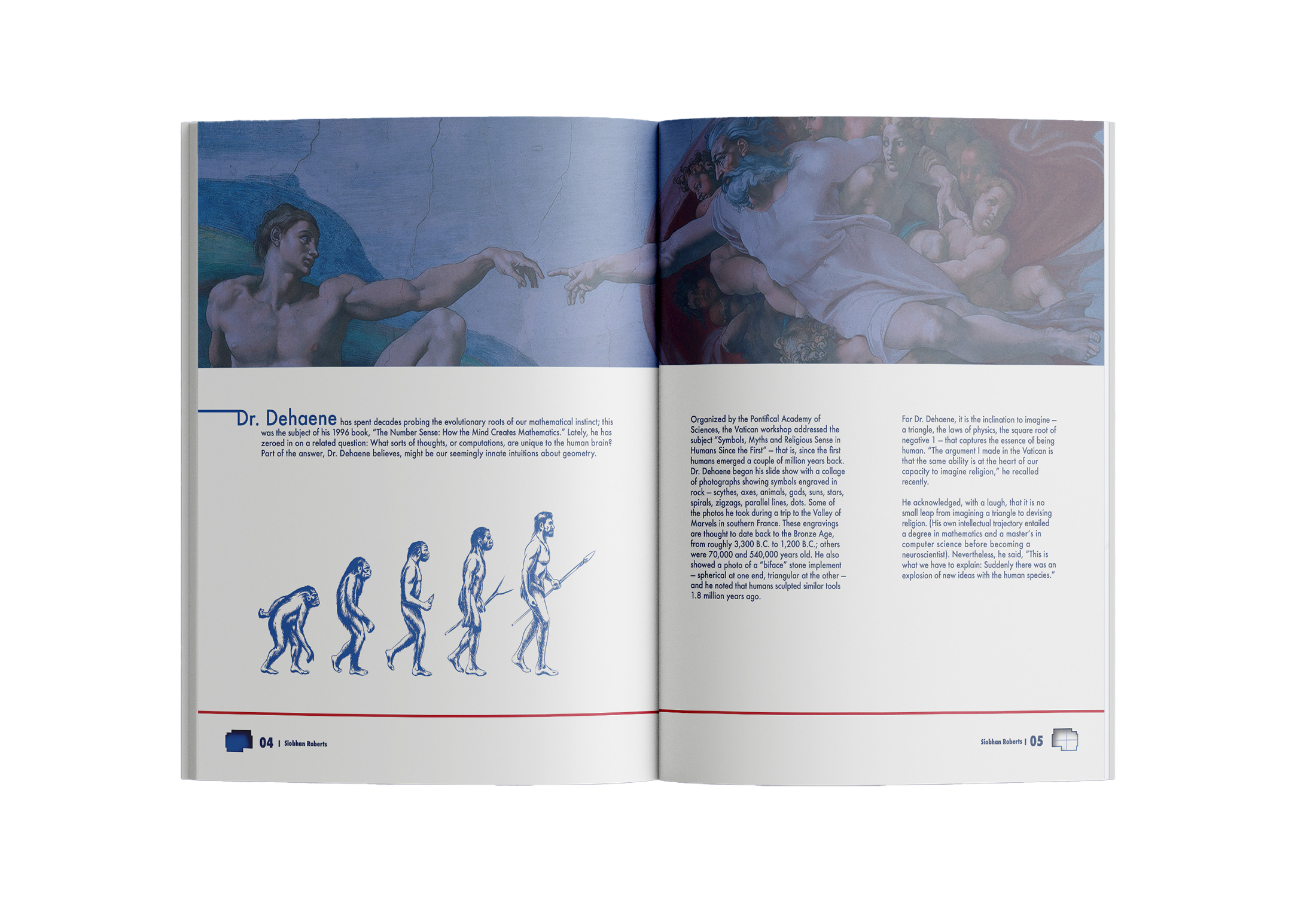
The layout follows a timeline, showing key moments in human evolution and the development of geometric understanding. This design helps readers connect geometry, cognition, and the digital age, highlighting how human intelligence has evolved over time.