Brandywine
Workshop
and Archives
Work
Discover / Define
Mission Statement:
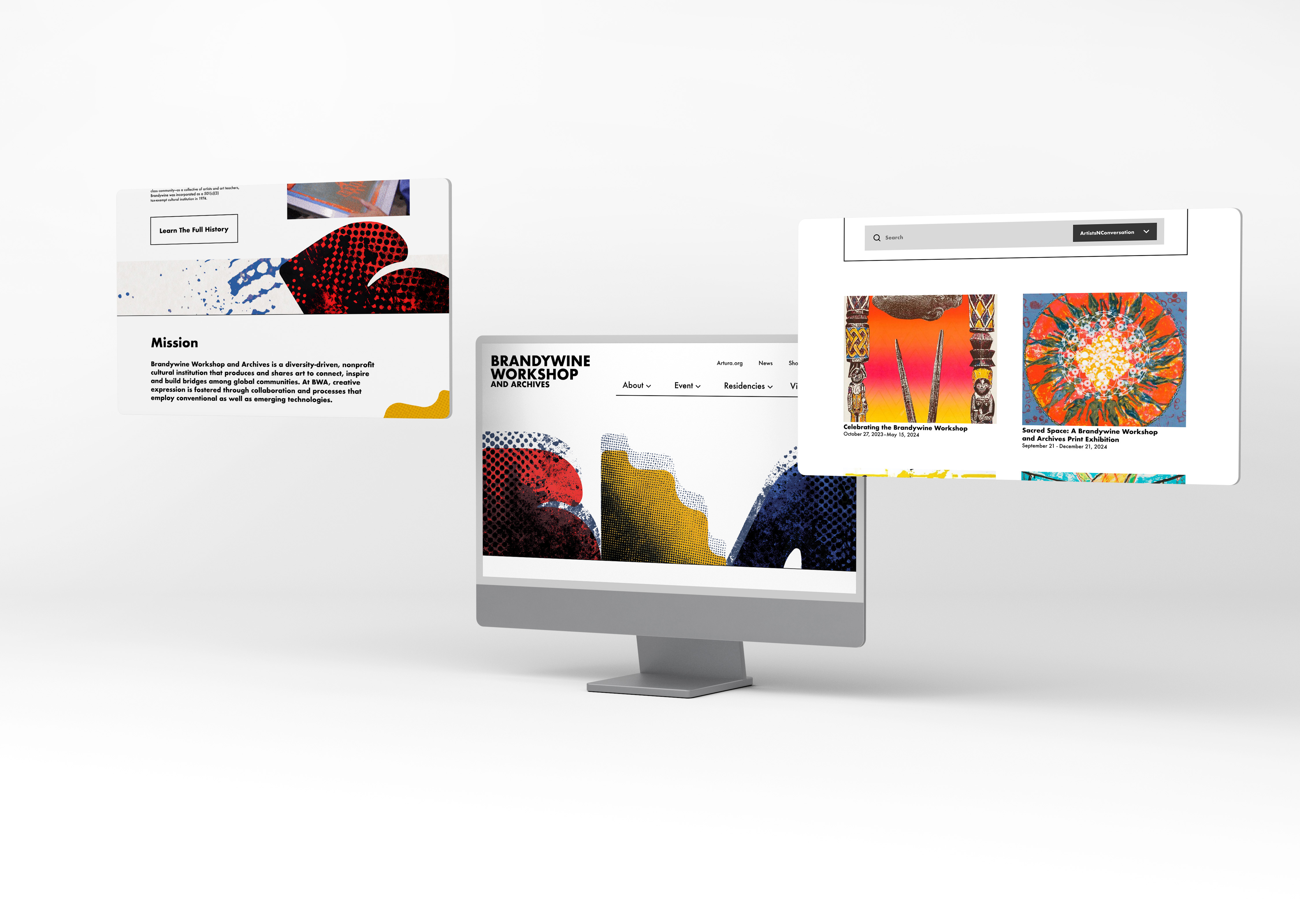
Brandywine Workshop and Archives is a diversity-driven, nonprofit cultural institutionthat produces and shares art to connect, inspire and build bridges among globalcommunities. BWA focused on emerging artists, expand and diversify their audienceby age, racial and ethnic heritage, nationality, gender, and sexual orientation.
Identity / Deliver
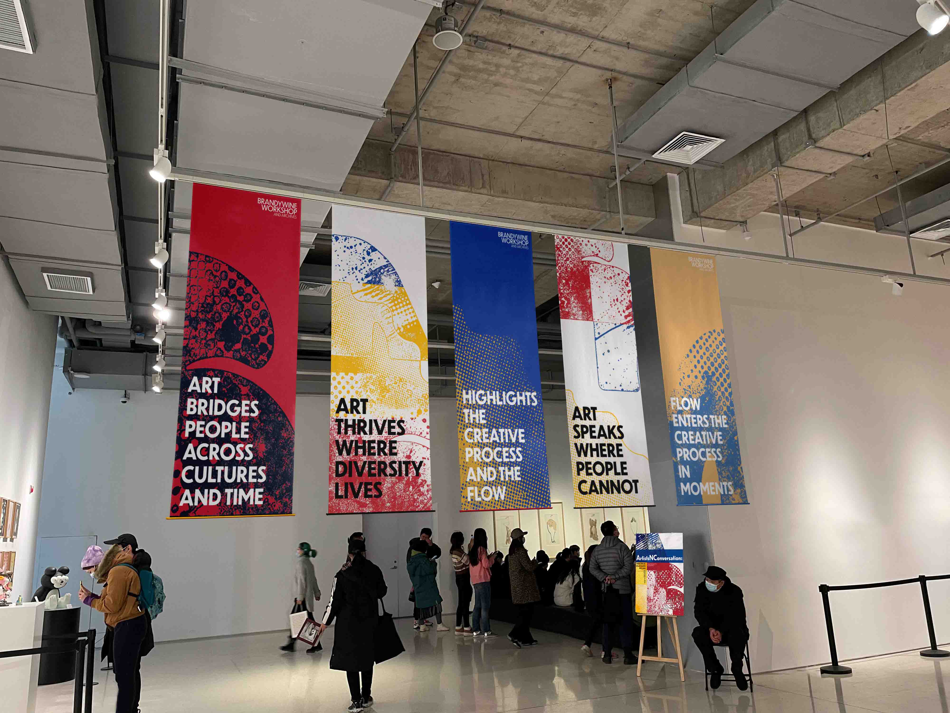
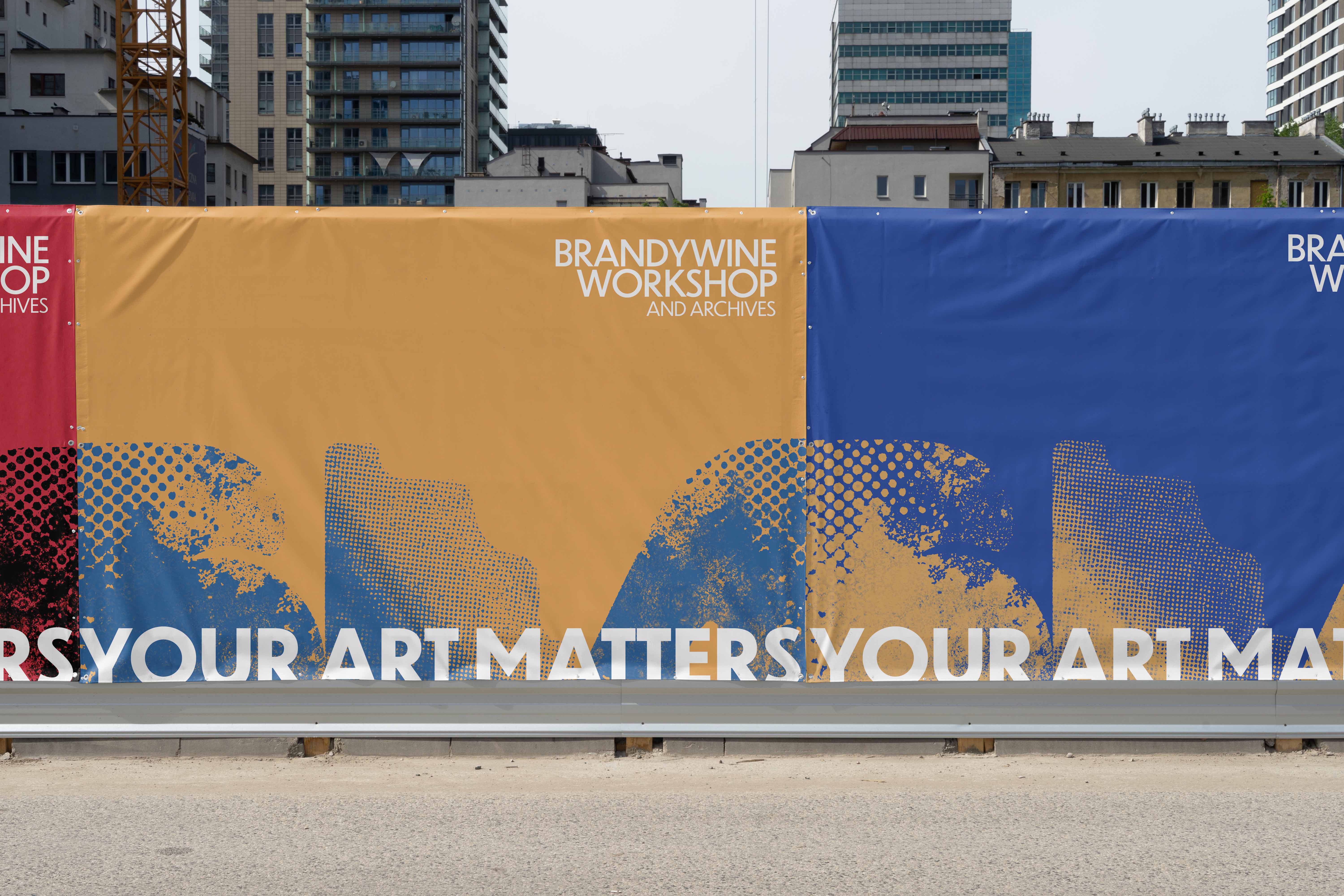
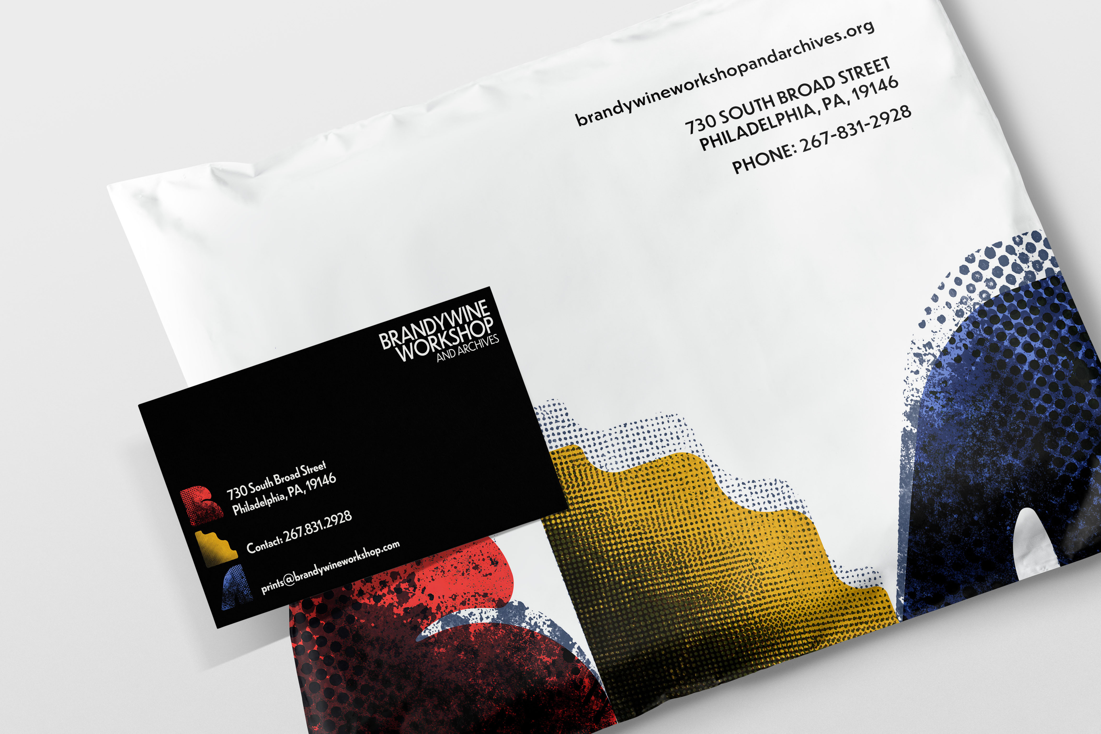
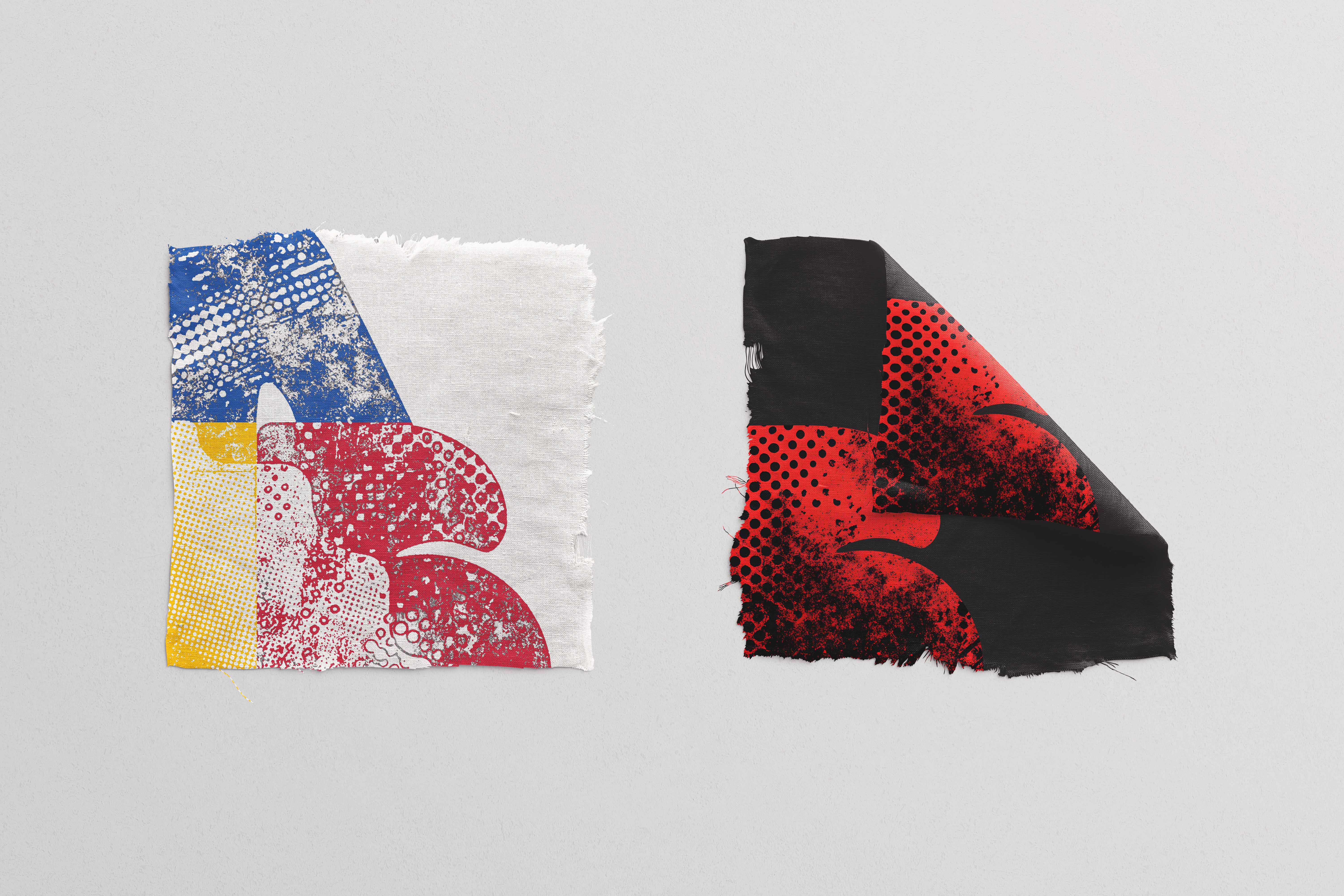
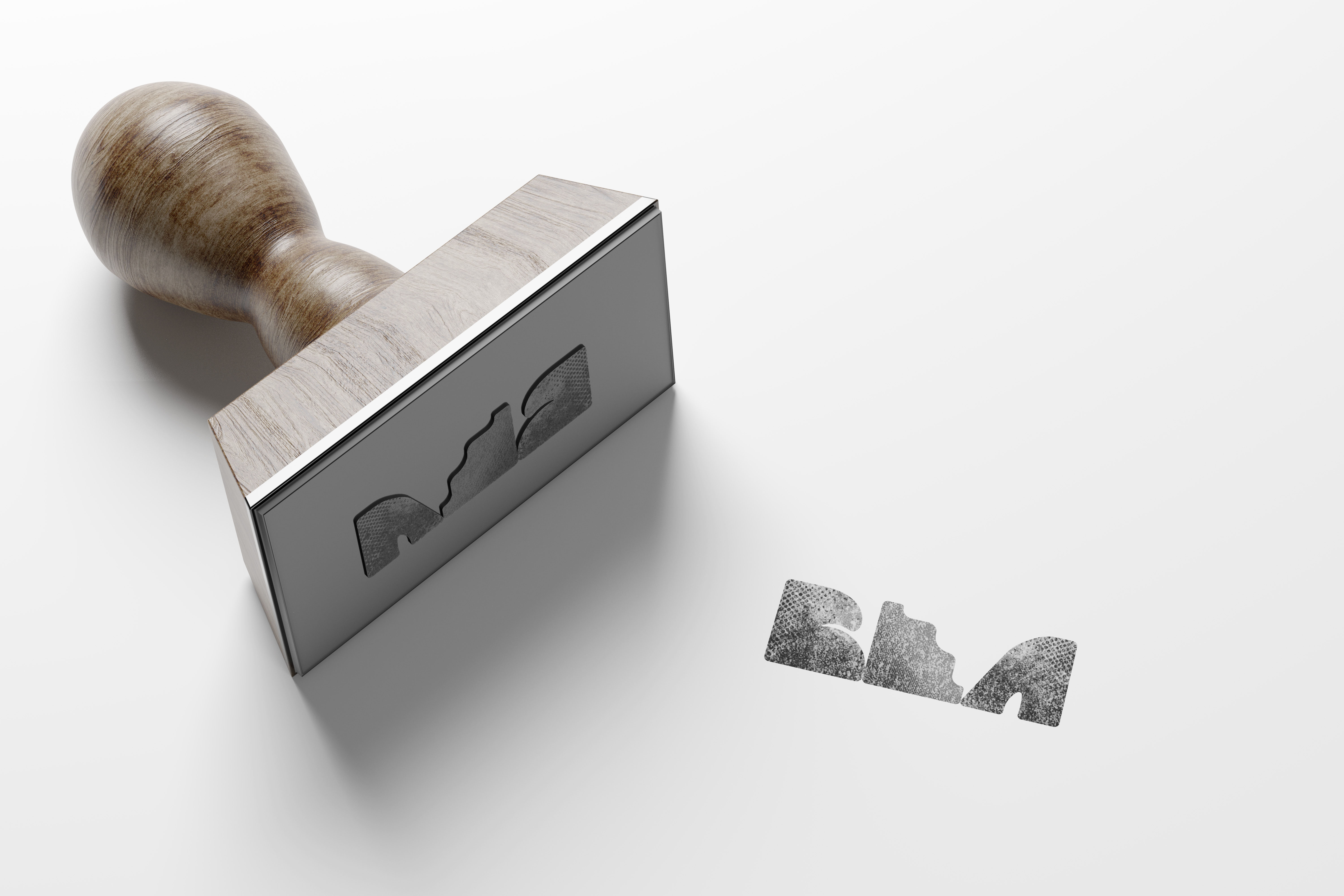
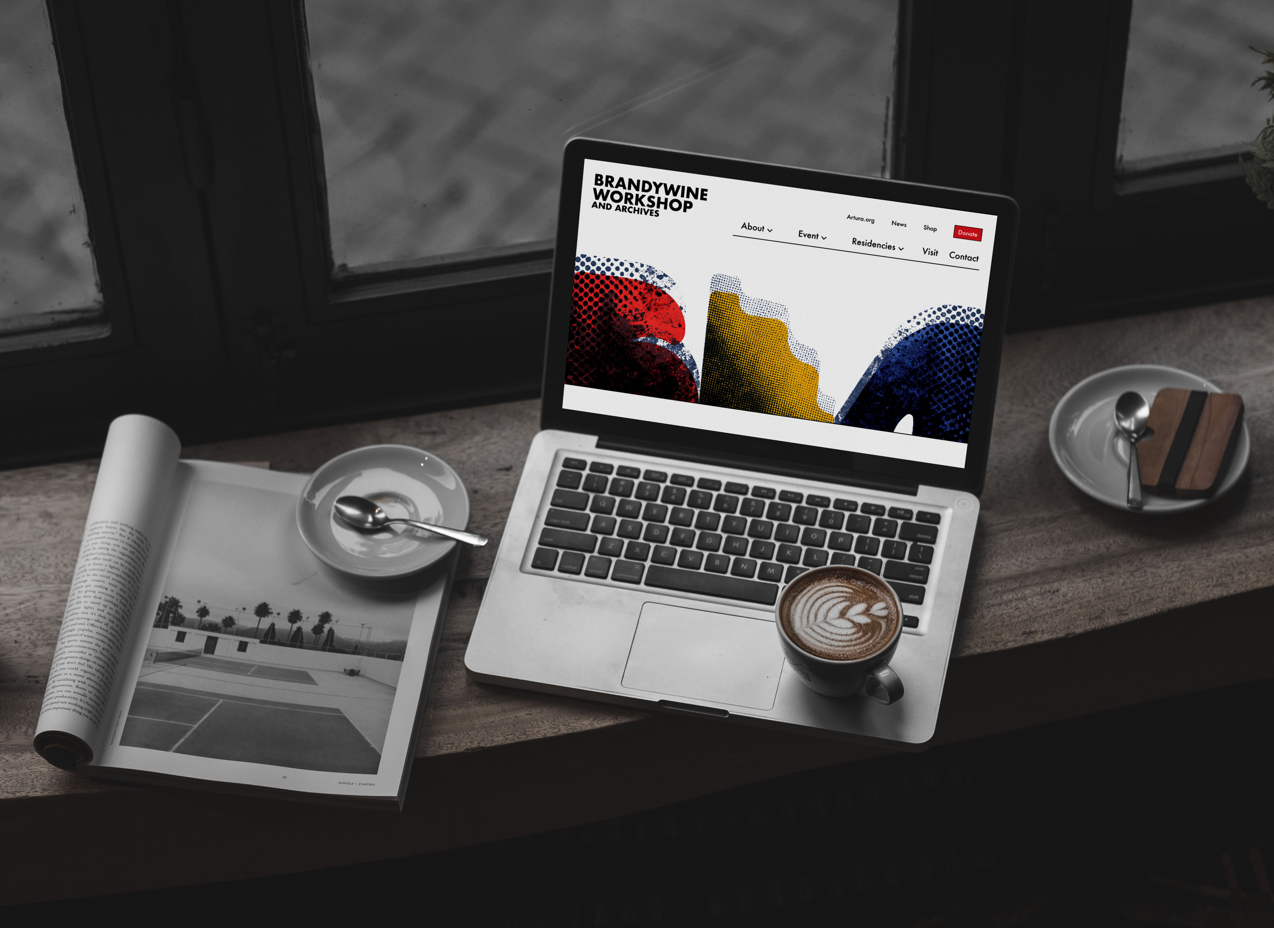
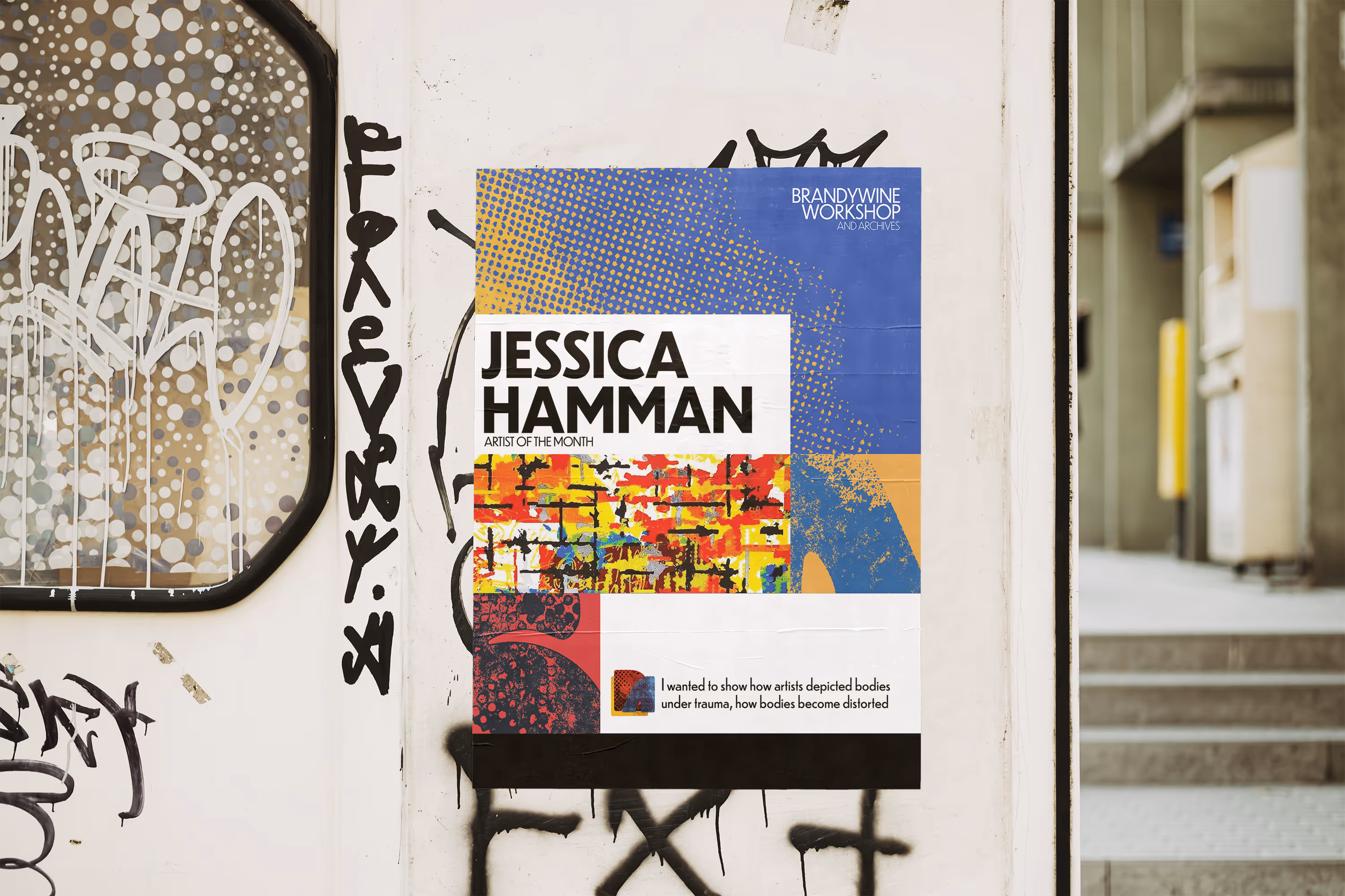
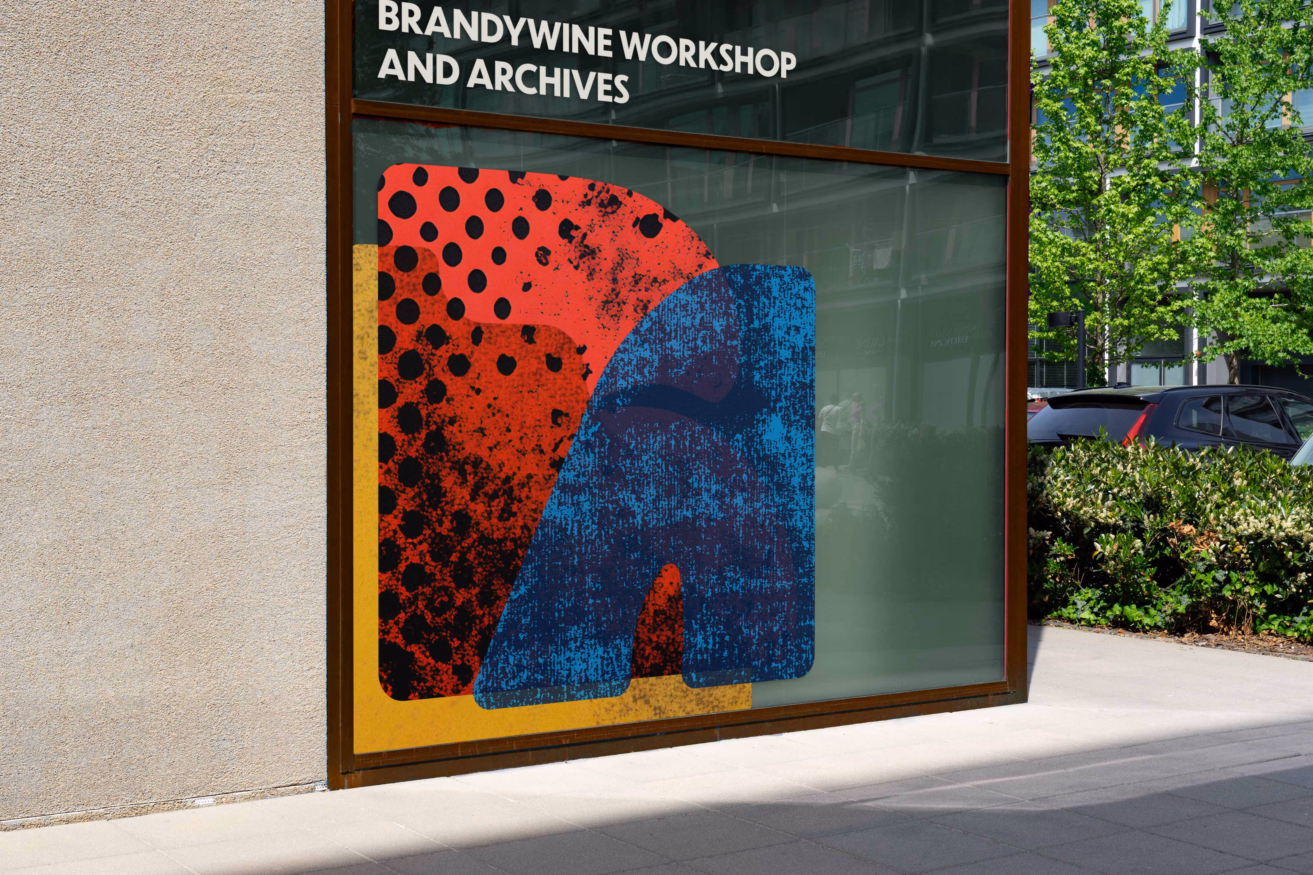
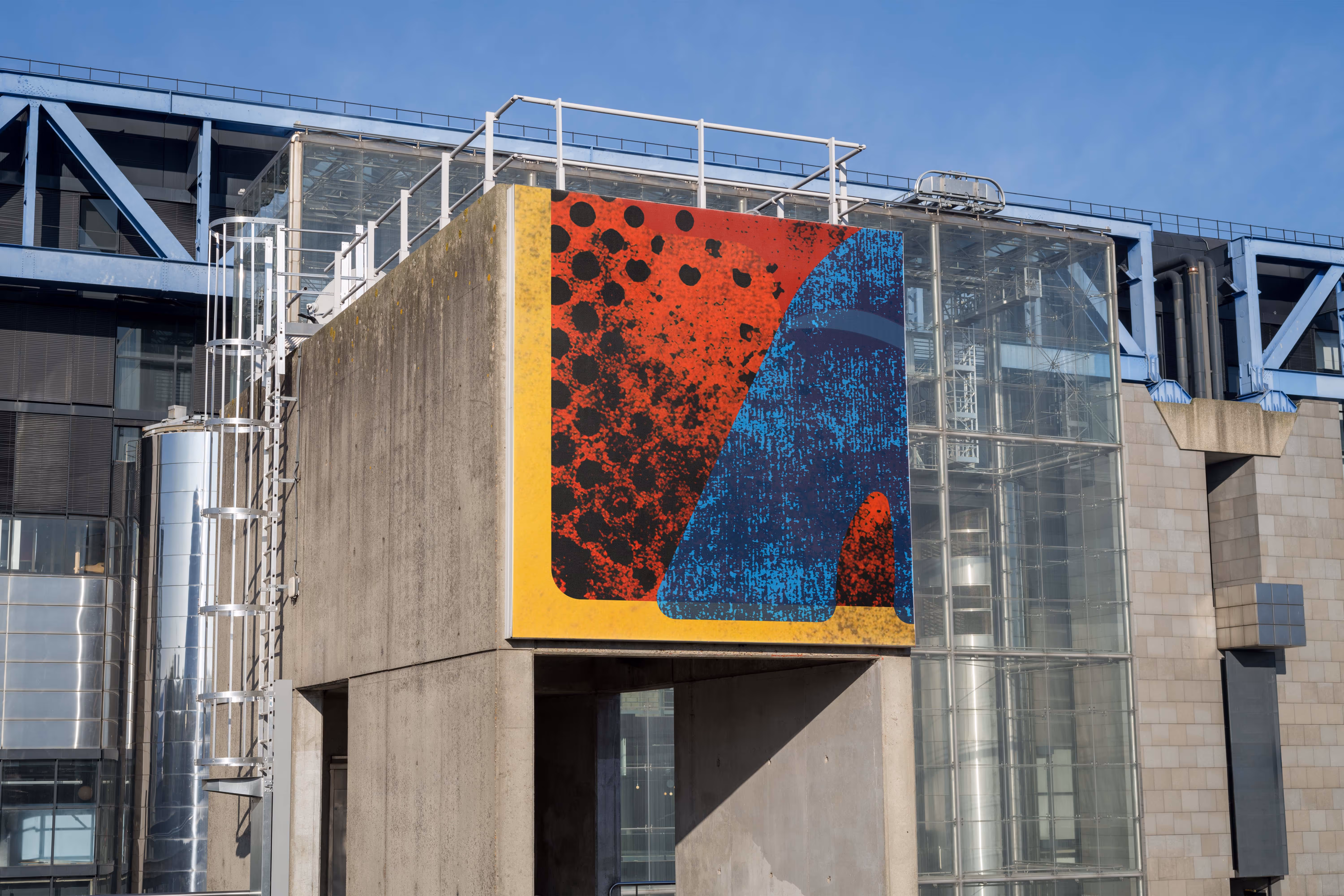
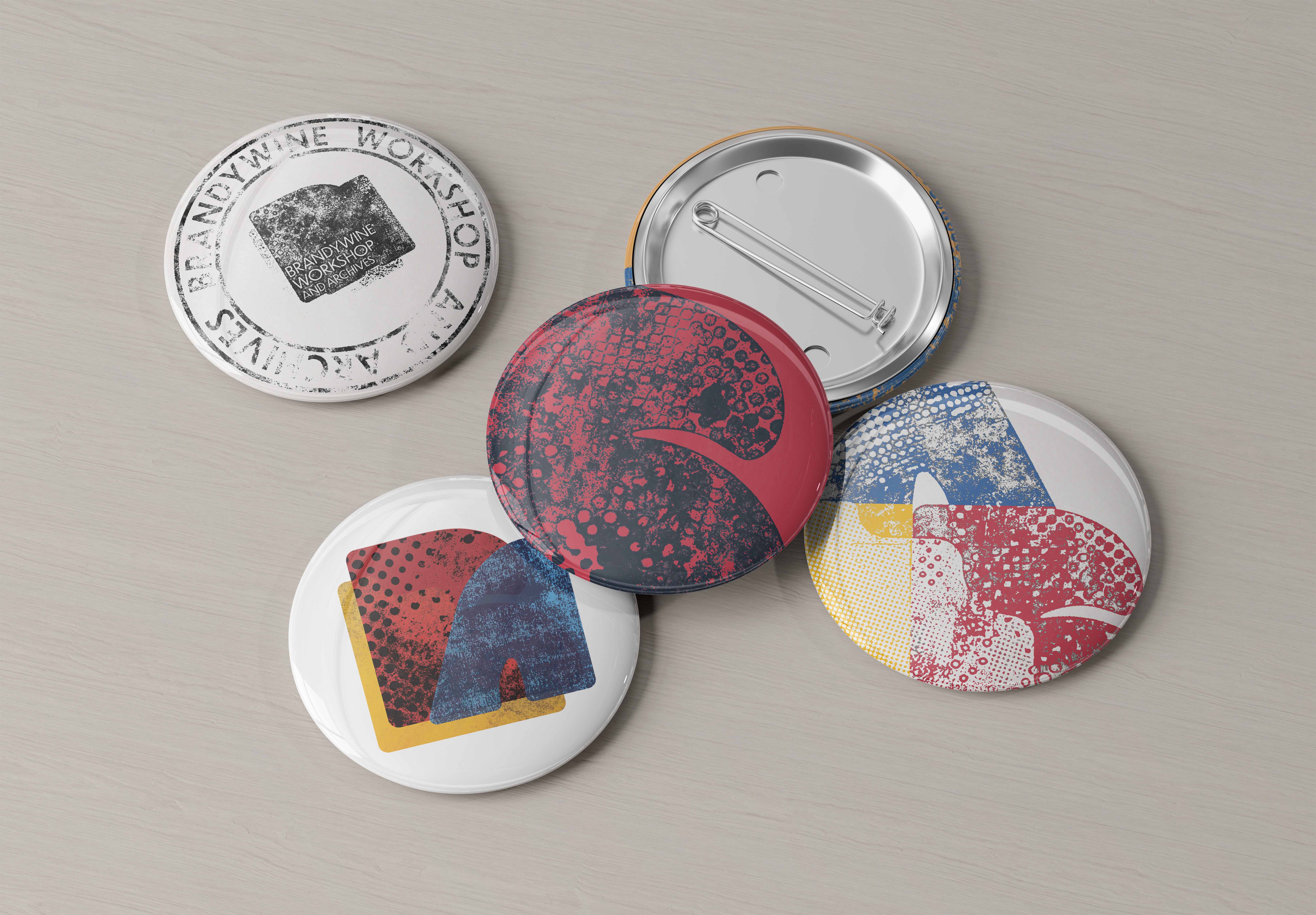
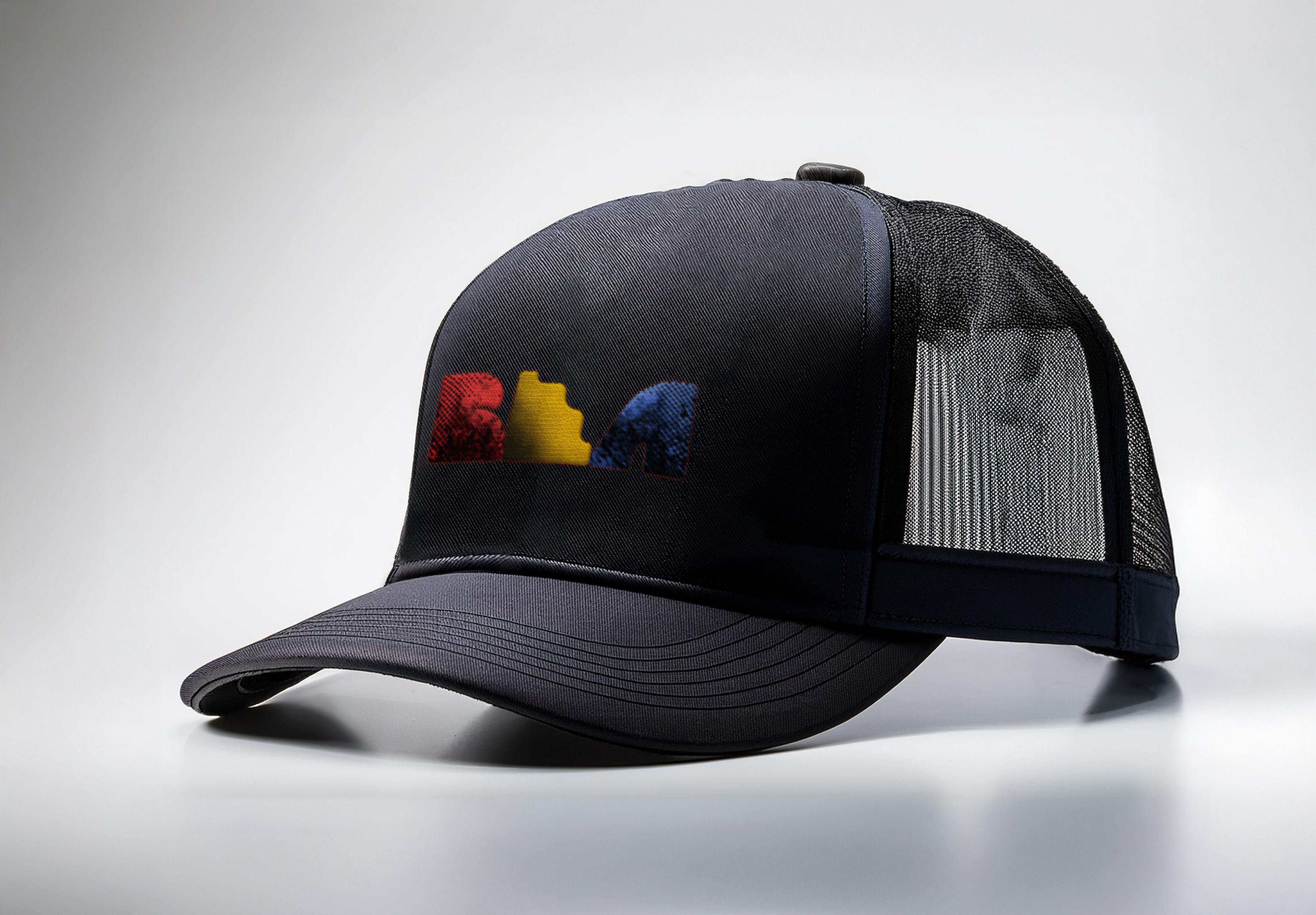
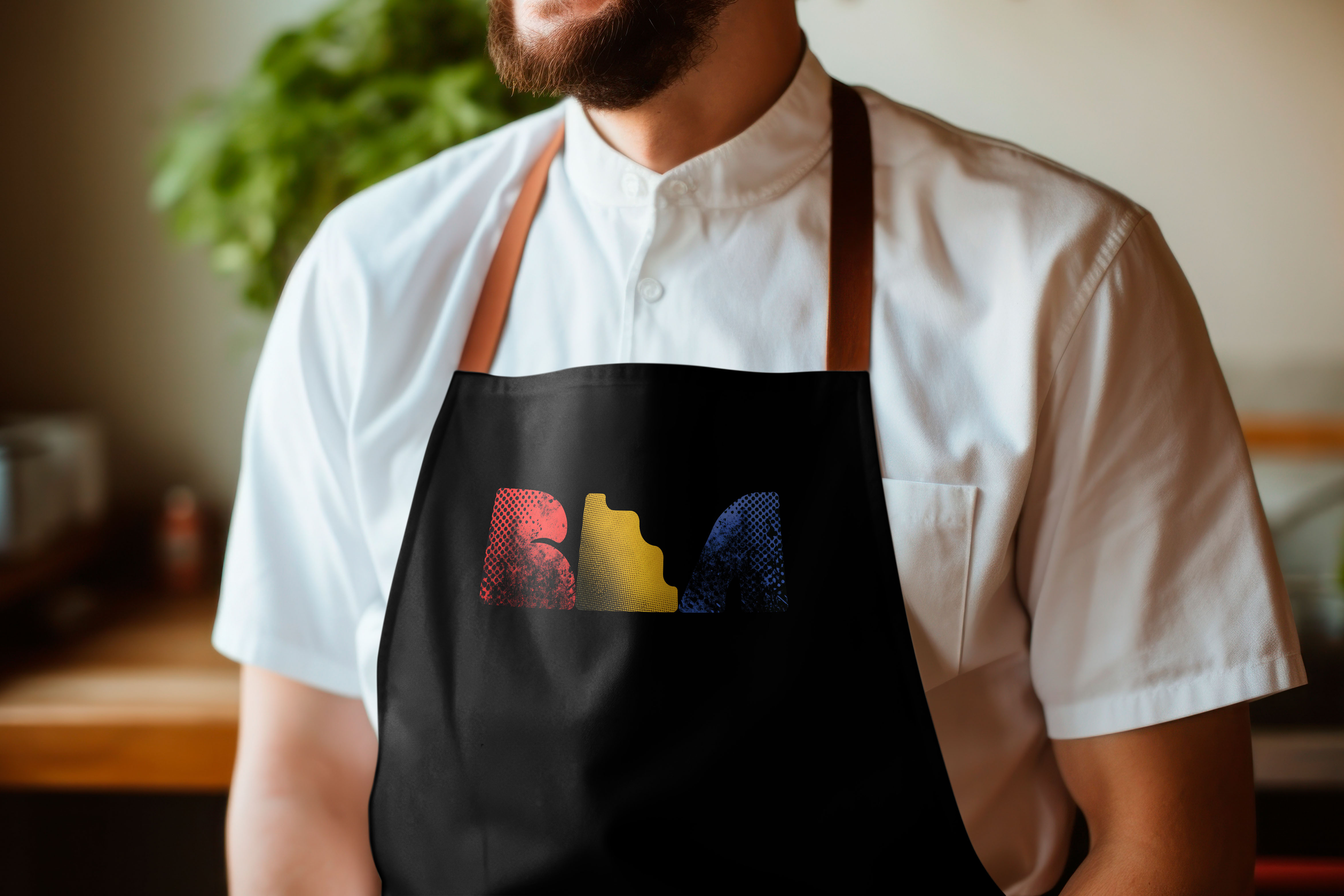
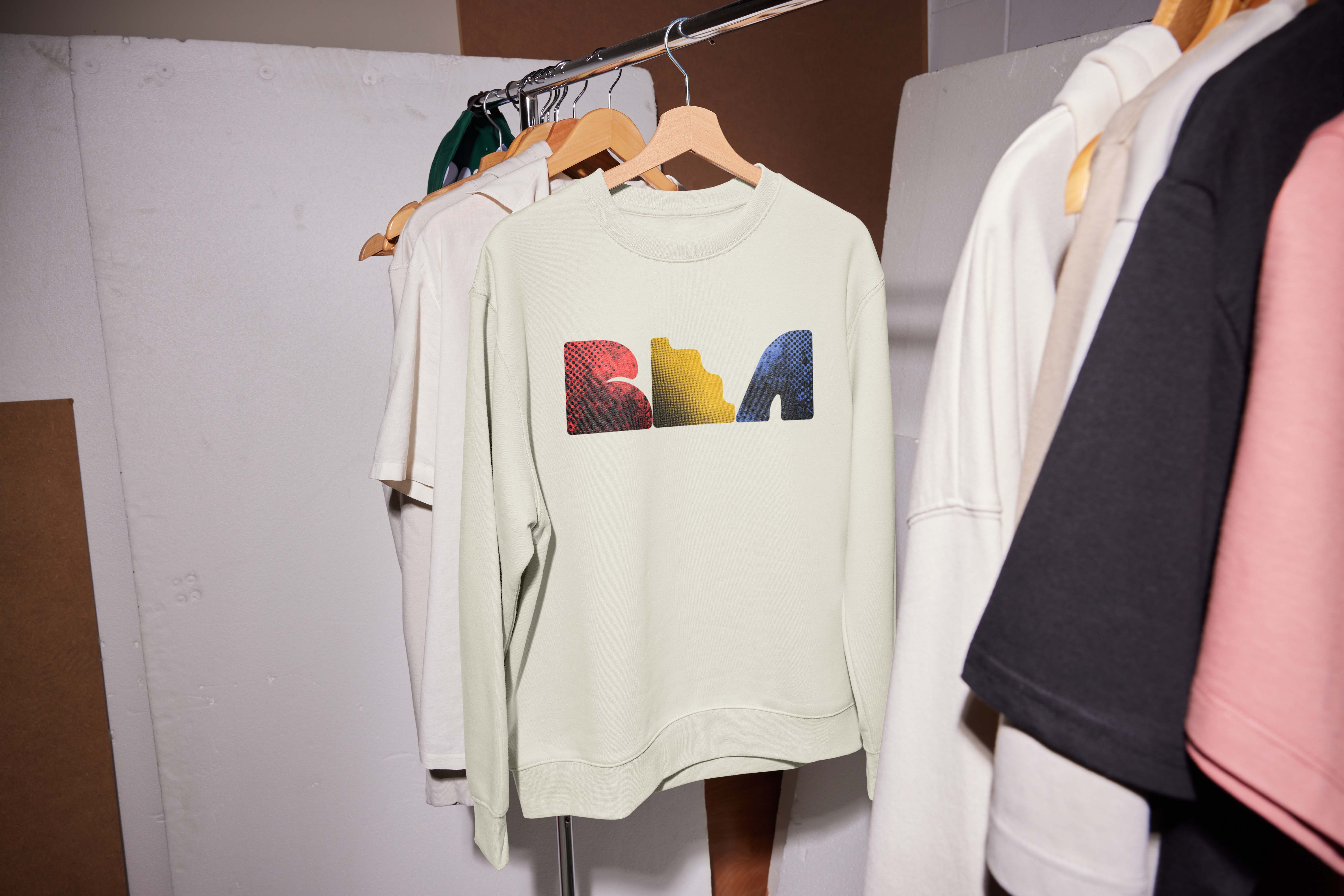
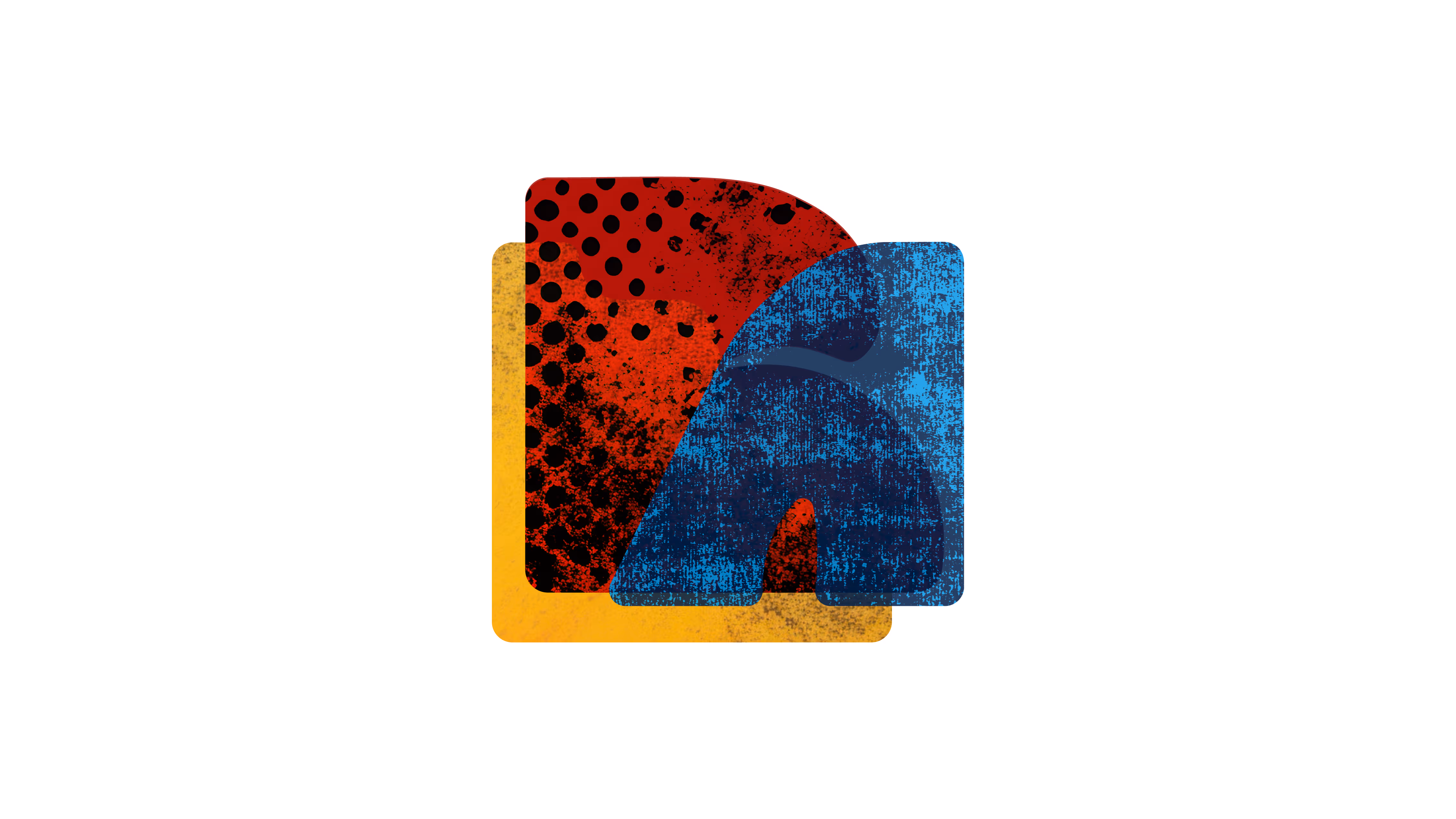
The Brandywine Workshop and Archives brand identity centers on the BWA abbreviation and reflects its mission of diversity, creativity, and global connection. Print textures like halftones are used to strengthen the link to printmaking and add visual depth. Each letter carries meaning: B (Brandywine) represents connection across communities, W (Workshop) represents collaboration and printmaking, and A (Archives) represents diversity and preserving unique stories. The identity highlights the organization’s role in bringing people together through art and sharing diverse voices globally.
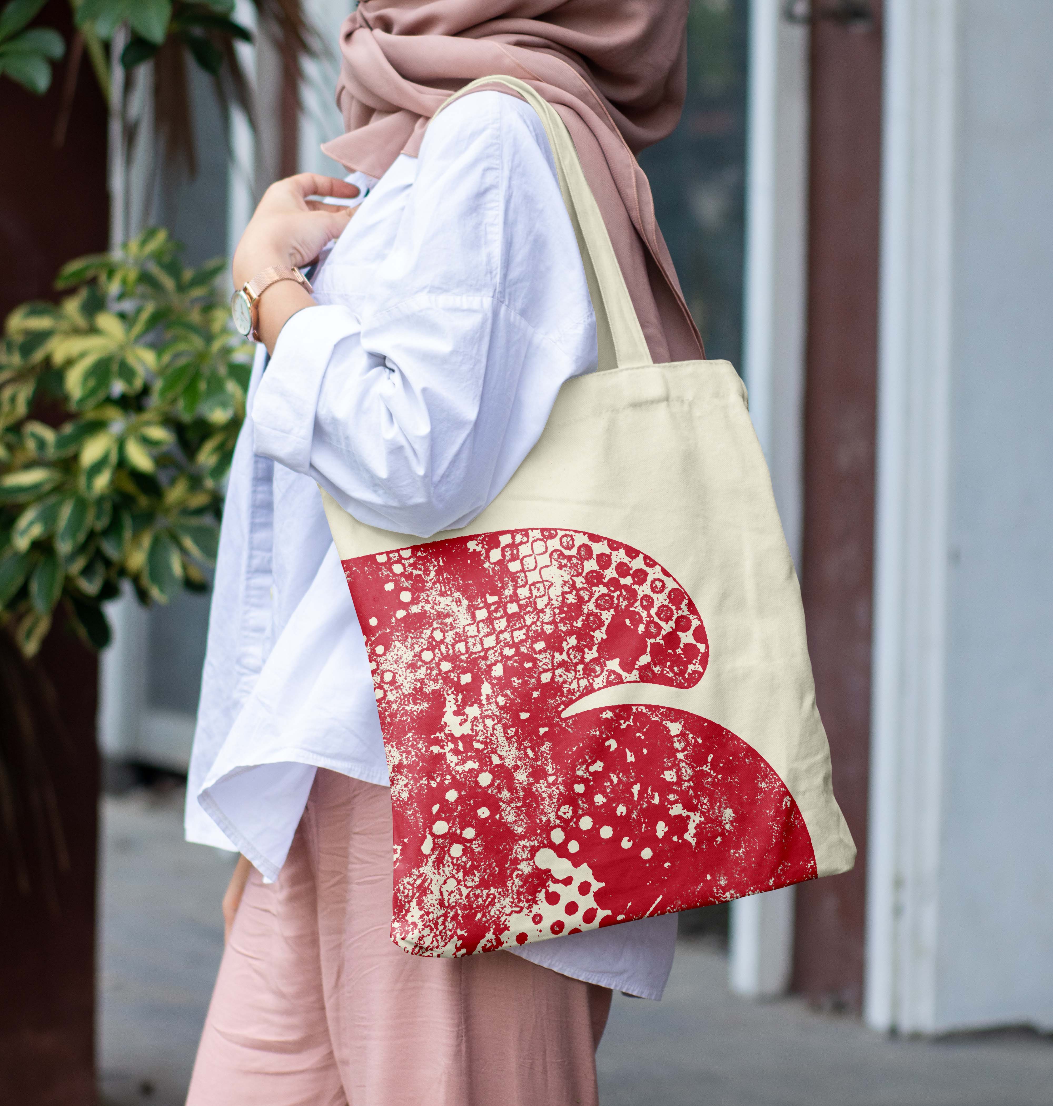
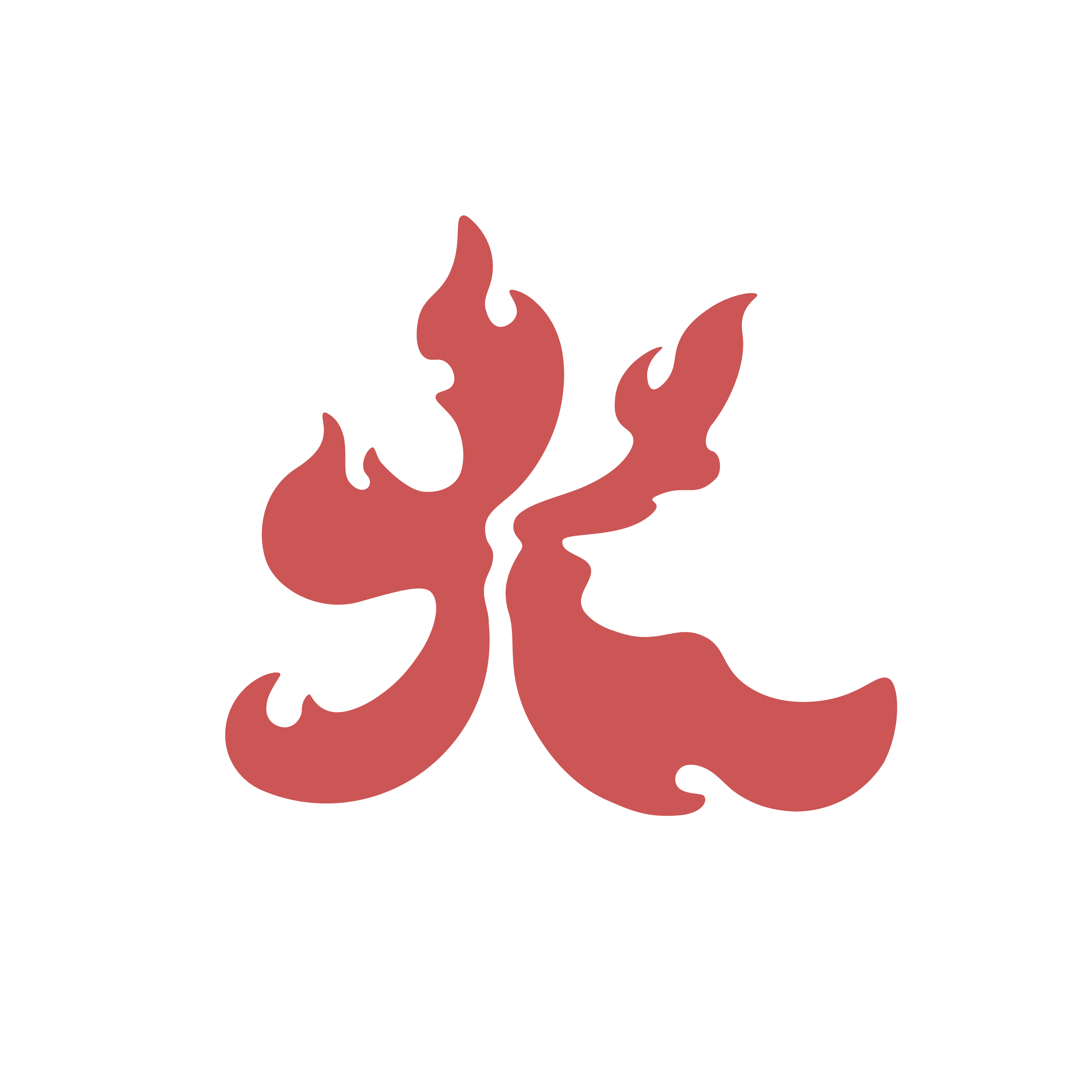
Logo B (Connection)
The color red embodies the spirit of printmaking and visual arts with its bold and passionate tone, while symbolizing connection and the building of bridges among artists worldwide. Its richness conveys creativity, strength, and unity, making it an ideal choice for fostering global artistic collaboration.
The design idea is matching the mission of Brandywine Workshop and Archives by representing connection and unity. The color's bold, strong tone reflects BWA's goal of supporting artists from different backgrounds and bringing people together through art. This color shows the workshop’s focus on helping new artists and inspiring global communities to connect.
Logo W (Printmaking)
Printmaking is the type of art that Brandywine Workshop and Archives is displaying. The color yellow connects with art, printmaking, and exhibitions through its symbolism of warmth, creativity, and energy. It adds vibrancy and richness to prints, highlights intricate details, and contrasts well with darker tones. In exhibitions, it creates a welcoming atmosphere, symbolizes achievement, and draws attention to key elements, making it ideal for celebrating and showcasing artistic expression.
This bright color is at the center of focus, where the letter "B" represents Connection and "A" represents Diversity, both facing toward "W" represent Printmaking. This symbolizes how the Brandywine Workshop and Archives uses printmaking and visual art to embody the idea of connection and diversity, bringing people, artists, and art lovers together globally by shining with its vibrant, attention grabbing yellow.
Logo A (Diversity)
Blue has the meaning of associated with the sky and the oceans, symbolizing vastness and global connection, which ties into the idea of uniting artists from around the world, regardless of nationality, ethnicity, or cultural background.
The letter here represents individuality and diversity by encouraging personal expression and creativity in artists. It symbolizes unity across cultures, fostering inclusivity and collaboration among artists from diverse backgrounds. Blue's calming and global associations reflect the connection between artists worldwide, making it an ideal color for celebrating both personal and collective artistic identity.
Visual Representation
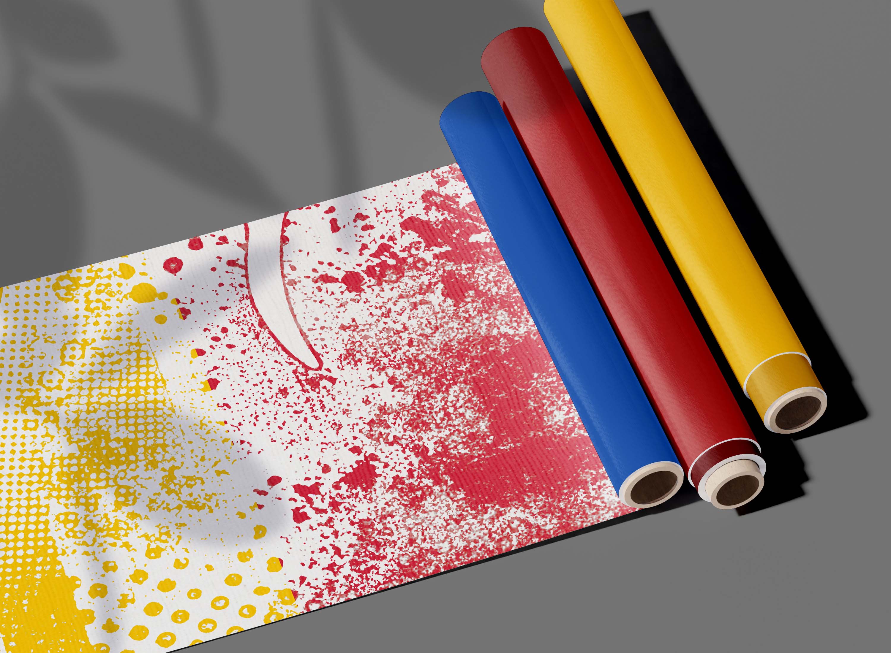
Color Palette:
This color palette is based on the three primary colors: red, yellow, and blue. These colors are the foundation of all others, symbolizing the diversity of artists. Just as they mix to create endless colors, artists from different backgrounds come together to form a vibrant and unified community. Each color is unique on its own, but stronger together, showing that all artists and all art matter.
The color #aa3131 is a bold red that represents warmth, energy, and connection. It symbolizes power and passion, reflecting the strong bonds between artists. This vibrant color creates an engaging atmosphere and encourages a deeper emotional connection to the art.
The color #edb018 is a warm golden yellow that represents creativity, warmth, and importance. It adds vibrancy and draws attention to key details, enhancing visual impact. In exhibitions, it creates a welcoming atmosphere, while in framing, it adds elegance and helps highlight the artwork.
The color #3765ae is a deep blue that represents unity, trust, and harmony. It conveys creativity and depth while fostering a sense of connection and belonging. This calming color helps create a welcoming and comfortable atmosphere.
The color #000000 creates depth and contrast, often used to highlight other colors and draw attention. In design, it represents formality, timelessness, and a sense of mystery. Widely recognized, it helps create bold, balanced compositions.
Typeface Choice
Dunbar Low:
Dunbar Low is a geometric sans-serif typeface with clean lines and balanced proportions, making it ideal for a modern and contemporary aesthetic. Despite its unique geometric forms, Dunbar Low maintains excellent legibility. This is especially important for exhibition branding, where text must be easily readable from different distances and angles.
Printmaking is a craft that requires precision and attention to detail, and Dunbar Low’s geometric shapes and clean lines echo these qualities. Its structured forms complement the meticulous process of creating prints, whether through woodcuts, etching, or screen printing.
A typeface like Dunbar Low helps modernize the image of printmaking, making it feel fresh and relevant to contemporary audiences. This aligns well with exhibitions that aim to reposition traditional arts for the modern world.
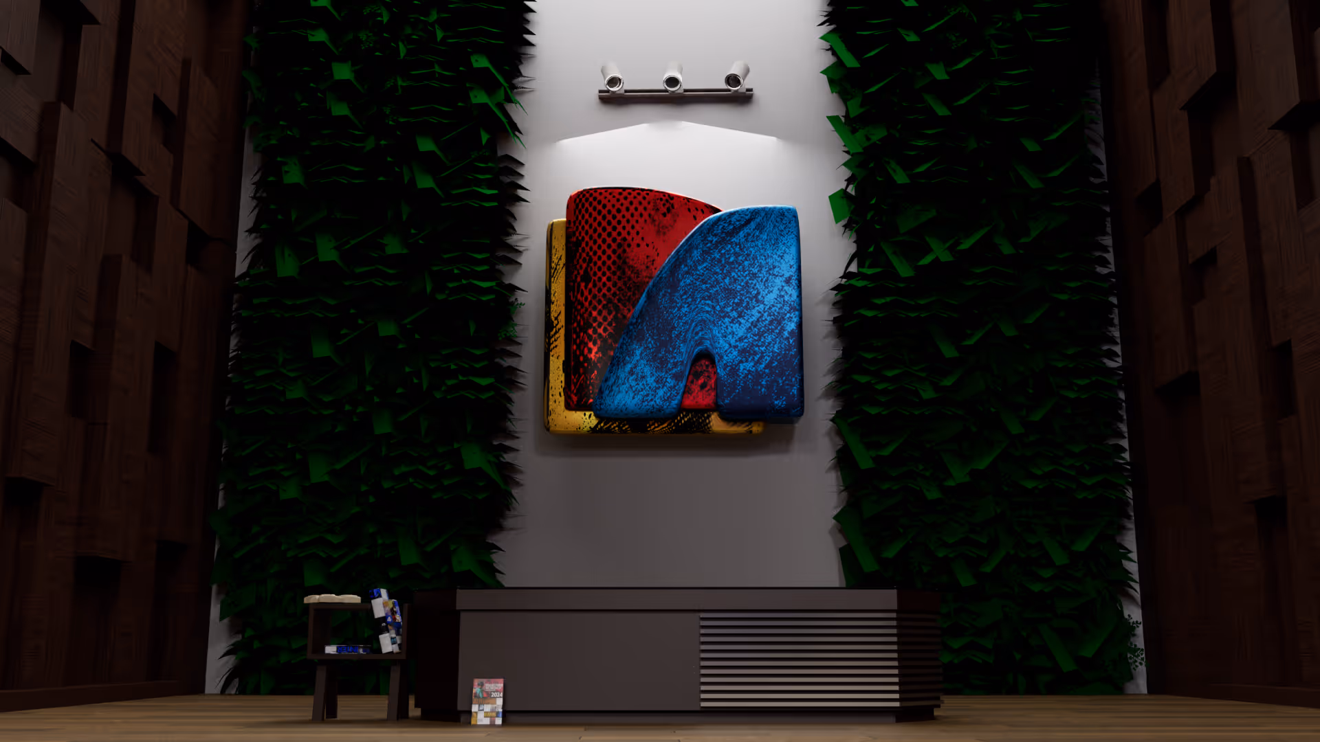
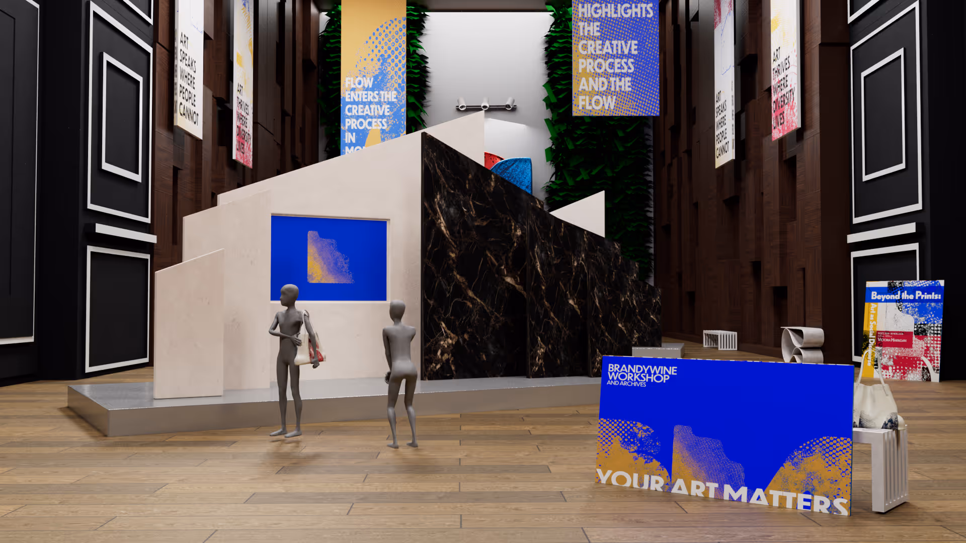
3D Animation
The combination of Graphic Design and 3D animation can expand the realism of the viewer’s experience in the design. Combining 3D design with graphic design creates a powerful visual language that comes to life. Graphic design creates structure, typography, color, and messaging, while 3D design adds dimension, texture, and spatial realism that brings ideas to life. Together, they enhance storytelling by allowing concepts to exist not just on a flat surface but within a dynamic space, making visuals more engaging and immersive. The two work together is especially effective in exhibition branding, where strong graphic systems guide the viewer’s attention as if they are in the actual exhibition themselves, and with the 3D elements create more memorable and impactful experiences across digital and physical platforms.
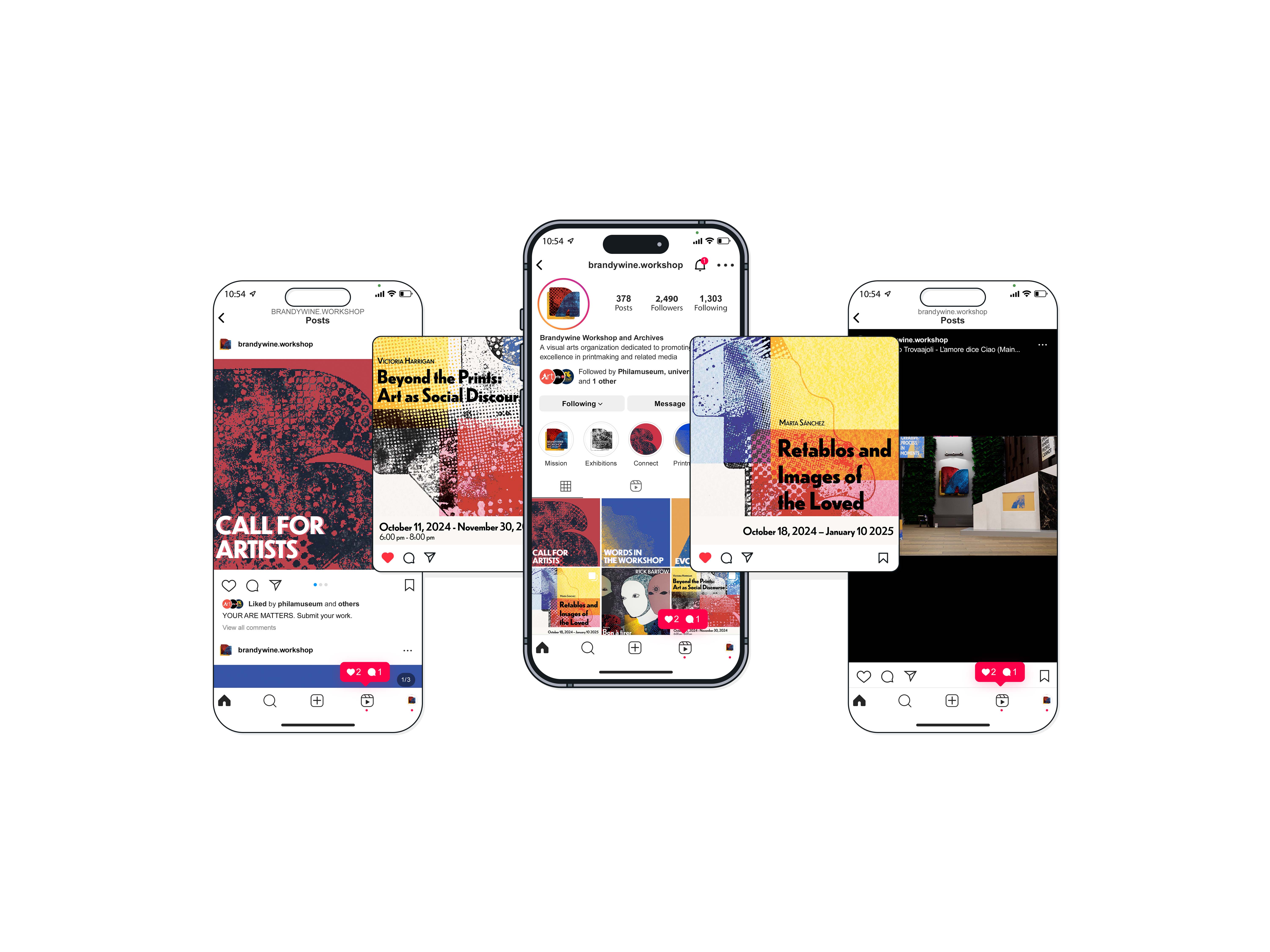
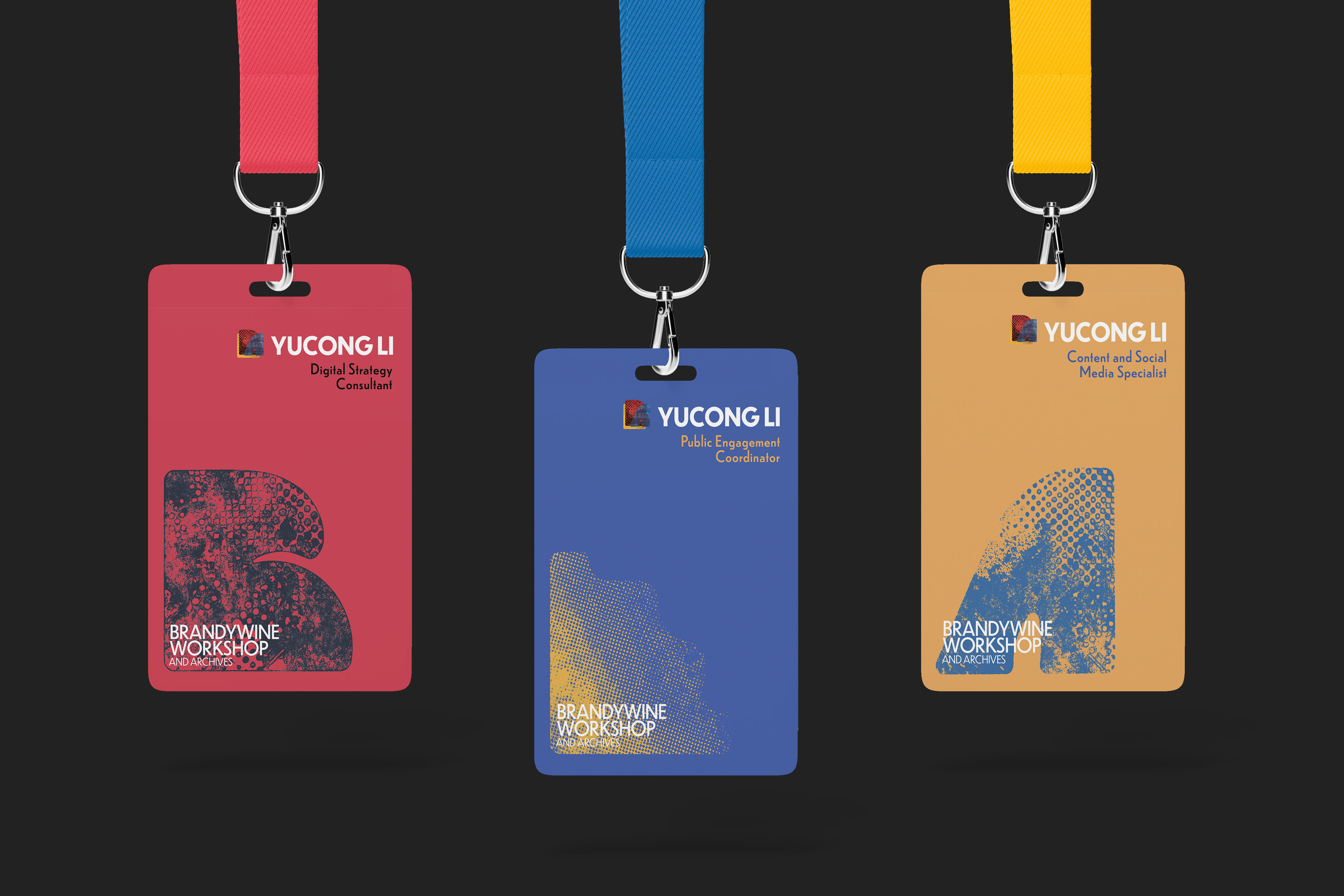
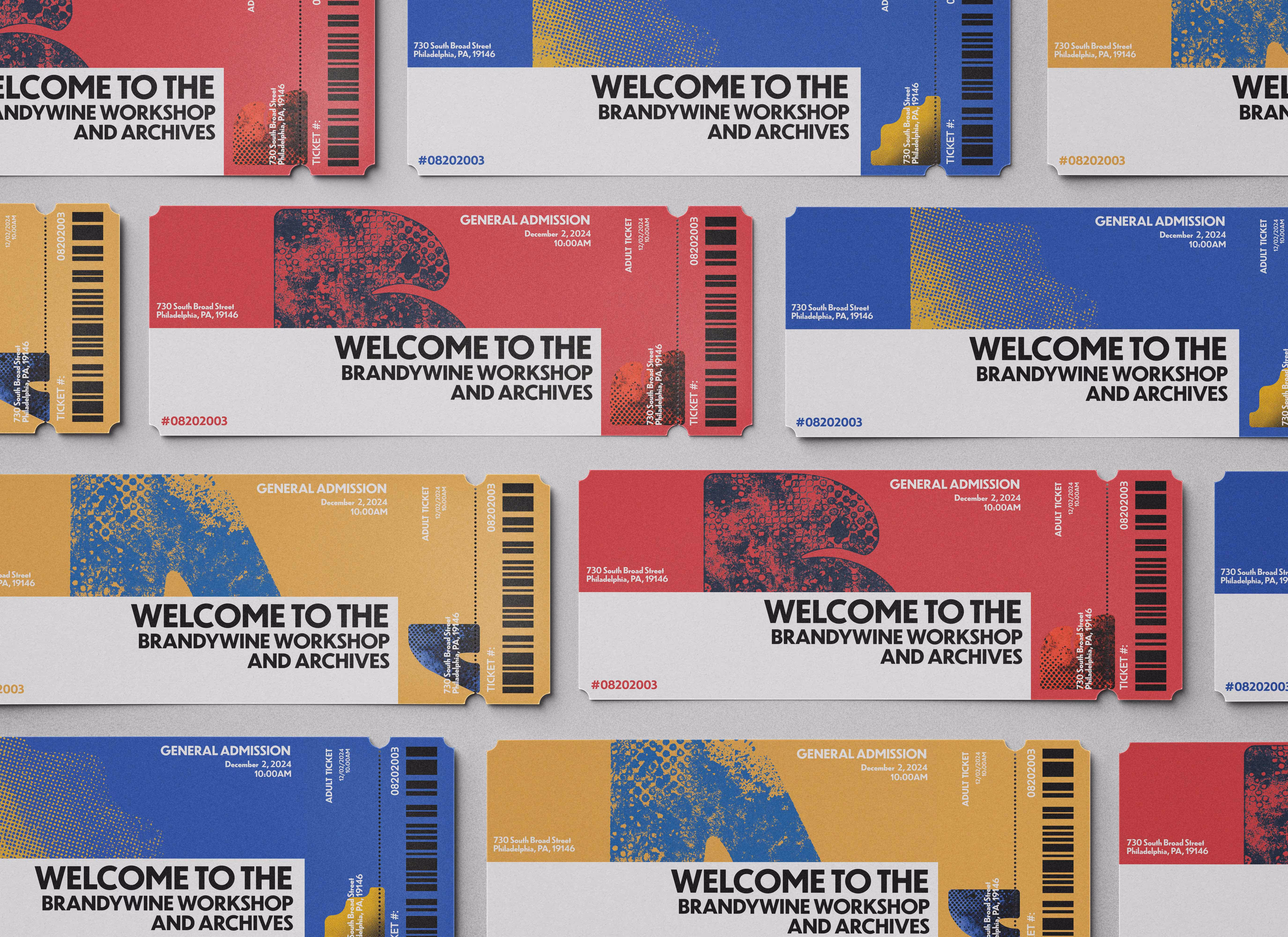
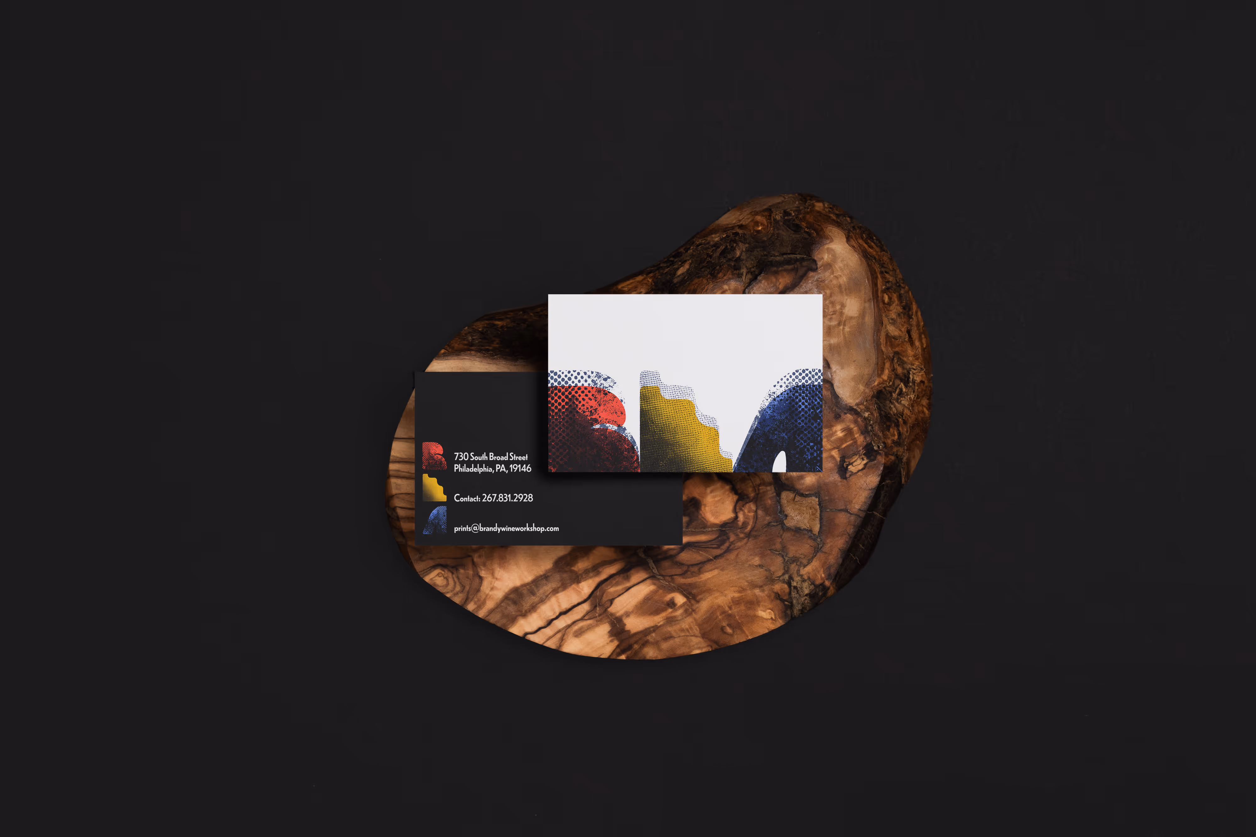
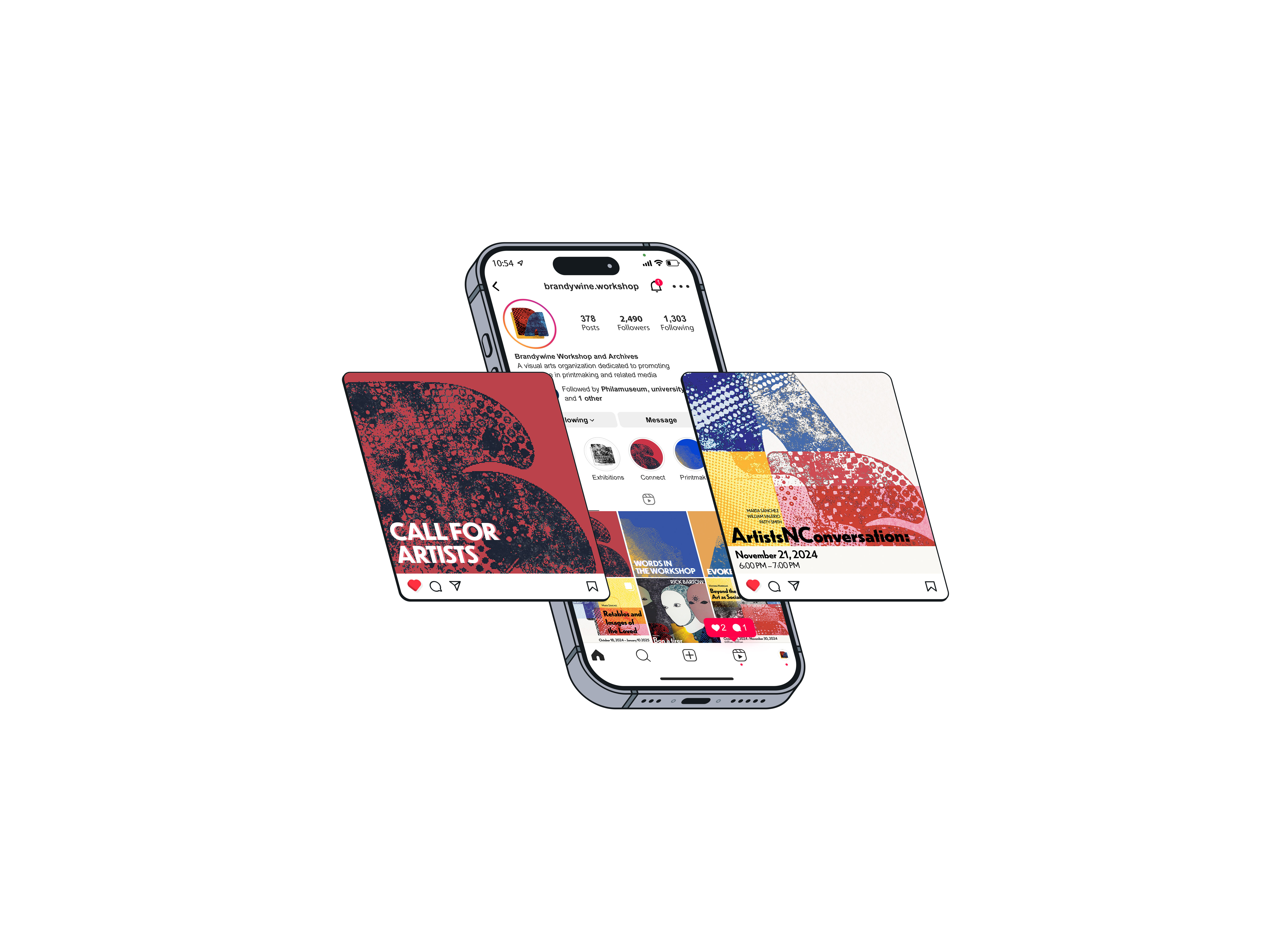
Application Design