WeChat
Mobile UIUX
Work
Discover / Define
WeChat’s UI/UX is designed to integrate its social and payment features seamlessly. The social software aspect focuses on a clean, minimalist design for easy navigation and engaging features like Moments Page. The WeChat Pay interface emphasizes trust, simplicity, and quick access, with clear payment options and green accents for reliability. This dual approach ensures a cohesive and user-friendly experience for both communication and financial transactions.
WeChat has become a very popular social software app in China, with nearly everyone using it. Not only is it used for communication, but it also features a payment system called WeChat Pay. Besides communication, the Moments page allows people to post photos and share joyful moments with others. The redesign aims to ensure these features are easier to navigate.
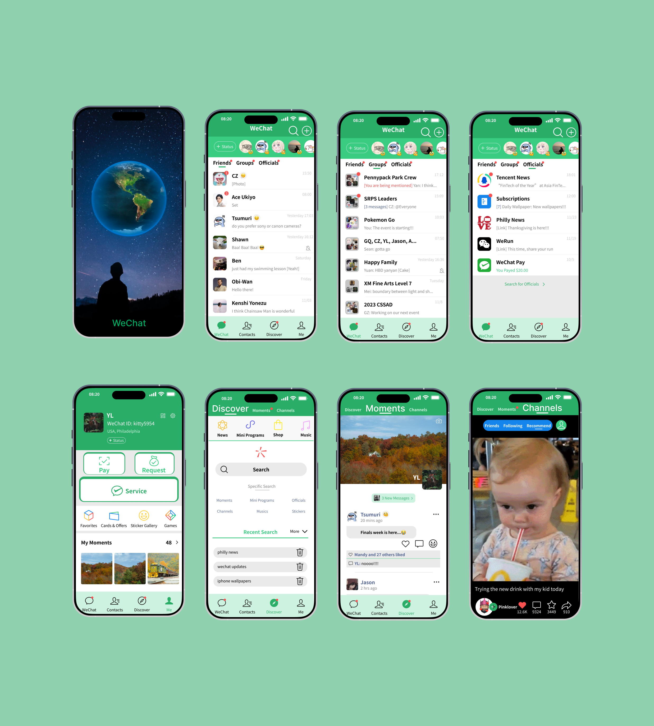
WeChat Redesign Pages:
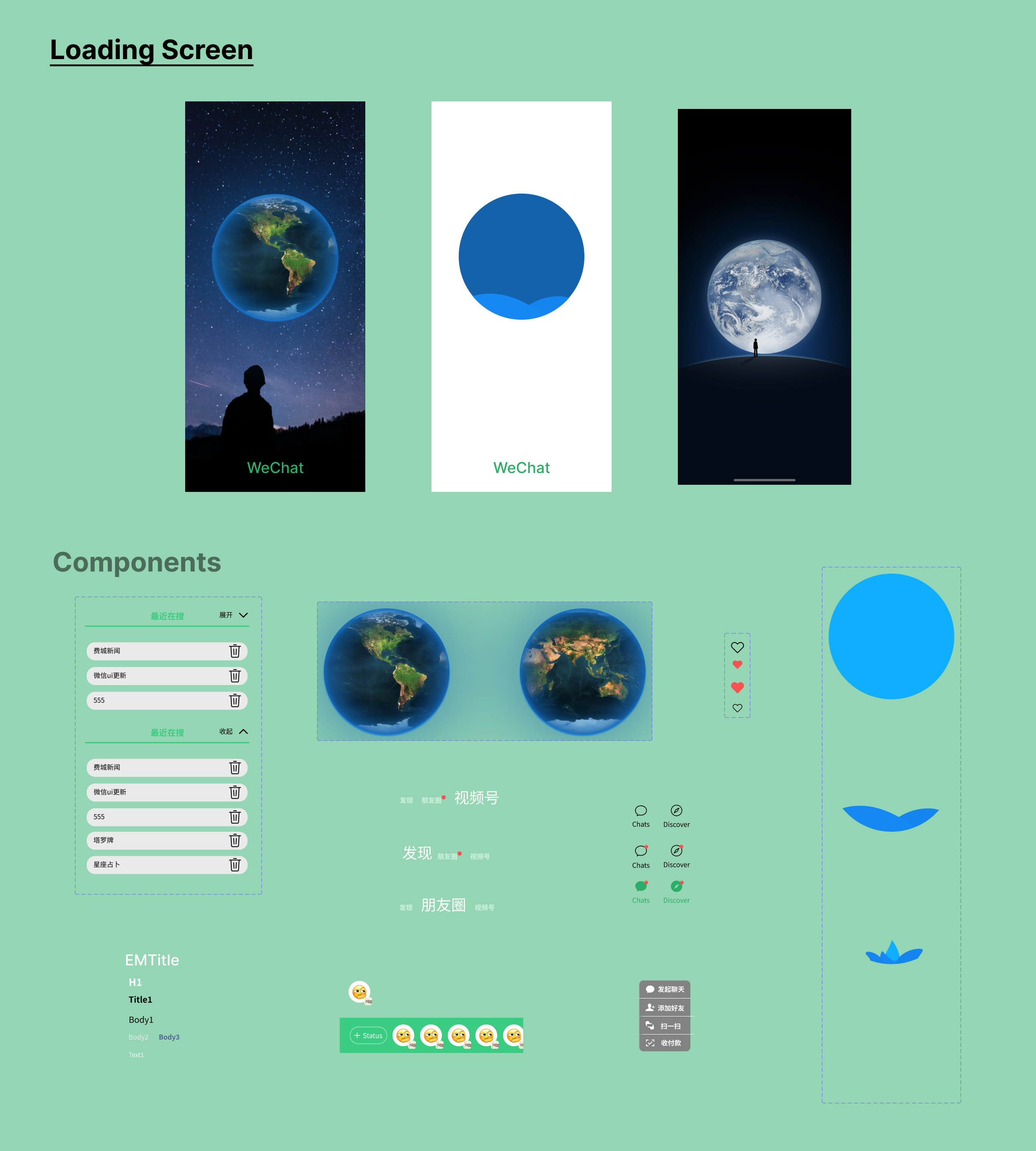
Loading Screen, Chat, Discover, Moments, Channels, & Me
Identity / Deliver
The original mobile app design for WeChat features a basic white and black theme with limited use of green on the platform. This design lacks a strong identity for WeChat, and navigation requires users to go through multiple buttons, making it less user friendly, especially when accessing popular pages within the app.
WeChat's UX/UI redesign focuses on creating a clean, intuitive interface that seamlessly integrates its diverse features. The redesigned interface emphasizes simplicity, utilizing a clean and uncluttered layout that allows users to easily navigate through various features. The green and white theme enhances brand recognition while keeping the interface visually appealing and organized.
Visual Representation:
Icons and Graphics:
- Introduce custom iconography with subtle green gradients or outlines.
- Use playful, simple animations for actions like sending messages or receiving notifications to create a lively experience.
Navigation:
- Within the navigation bar, it will have a Discover button containing the most used pages like Discover, Moments, Channels section into one single tap of a button itself that can take user to the page. This reduces the need for multiple taps and scrolling.
- Redesign the Chat, Discover, & Me pages for easier navigation especially the popular discover page.
Color Palette
Green is a core of WeChat’s brand identity and makes the app instantly recognizable. Using it consistently across the logo and interface strengthens brand recognition. In Chinese culture, green also represents health, vitality, and renewal, fitting WeChat’s active user base.
The color #2aae67 which is also the primary brand color green WeChat uses all over the platform has its meaning and associated with growth, harmony, and trust, which aligns with WeChat’s role as a platform for communication and connection.
The color #000000 which is also black is used for text to maintain high contrast and readability on white backgrounds. Besides black wechat also uses #C6C6C6. Gray is used for secondary elements, like placeholders, inactive states, and dividers/lines. The distinction between black as for the primary information and gray for secondary information creates this a clear visual hierarchy for the user to see. These colors provide a professional and versatile foundation that works seamlessly with green and white.
The color #ffffff also white color dominates WeChat's interface, providing a clean, uncluttered background for content and features. White offers high contrast with text and icons, ensuring a smooth reading and navigation experience. The use of white especially as a background draws attention to content, such as messages, people moments, and more.
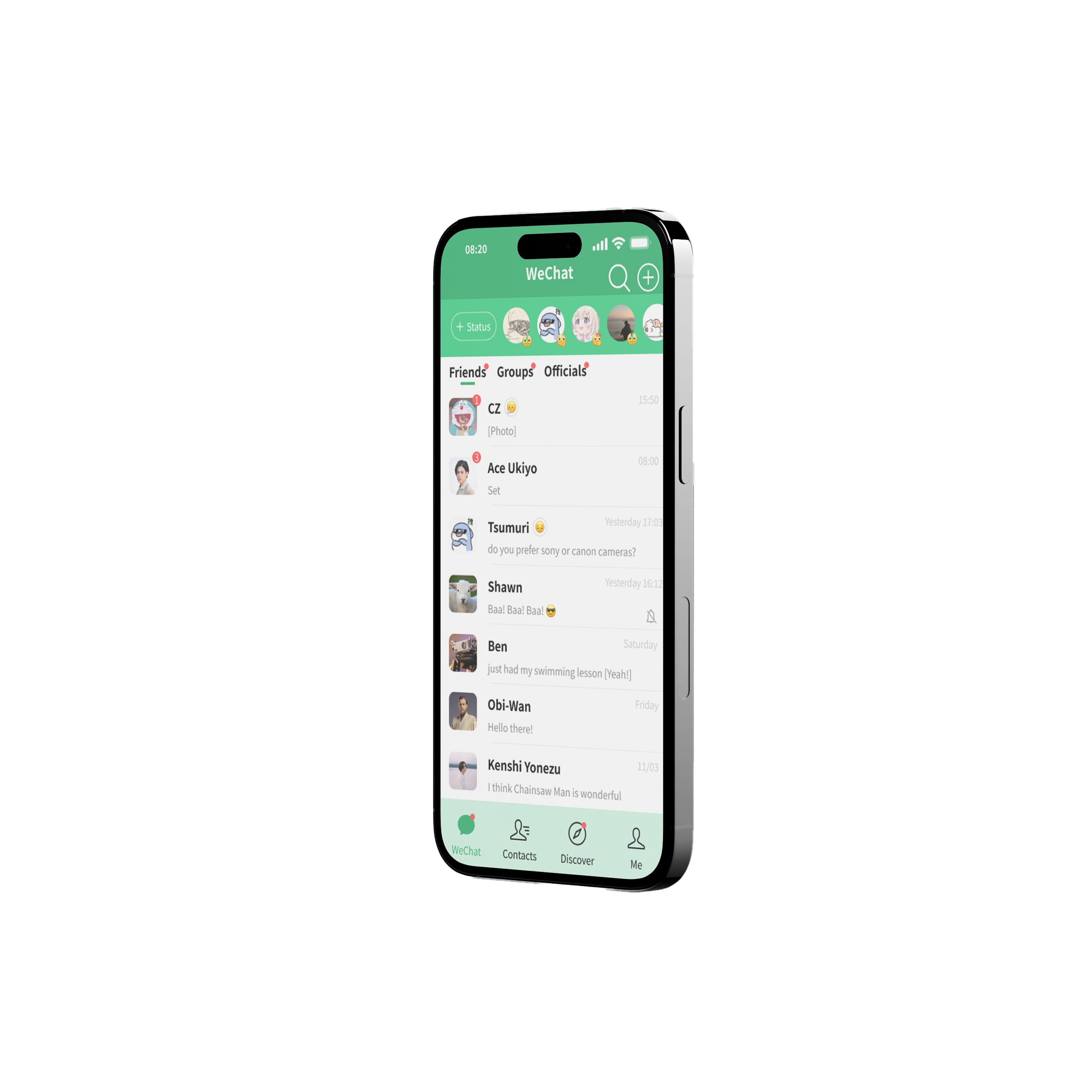
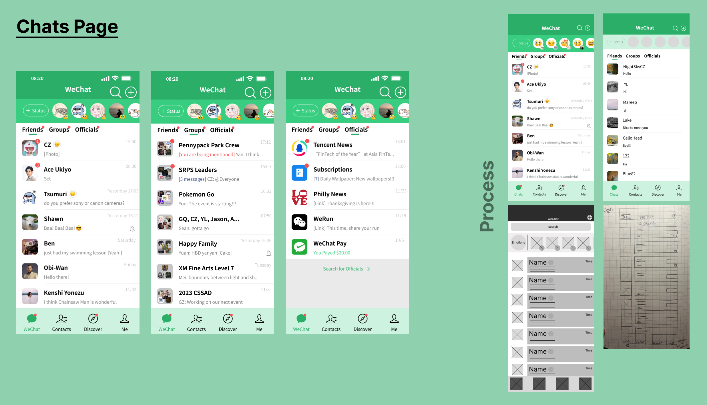
Chats Page
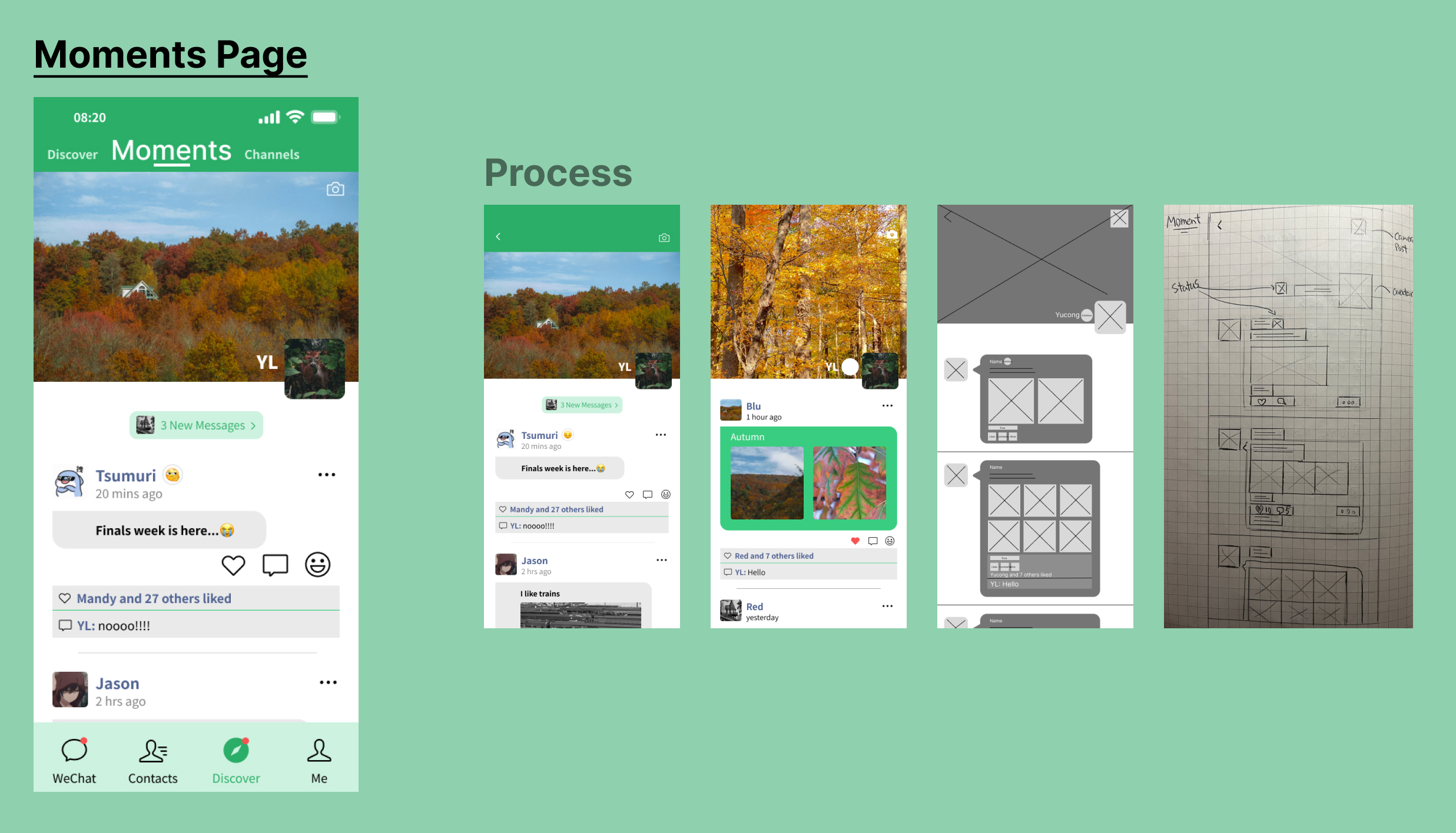
During the low fidelity wireframes I had the idea of input the daily emotion that is pretty popular for user into the home/chat page. This UI design is only shown at the Me page which if user's friend wanted to known if anyone added an emotion today they have to find it by tap to their Me page. The redesign did something differently by adding the small section at the top with the horizontal scroll showing both the avatar and emotion if they added one today, and when user tap into it they can see the bigger stories/image and text to that emotion.
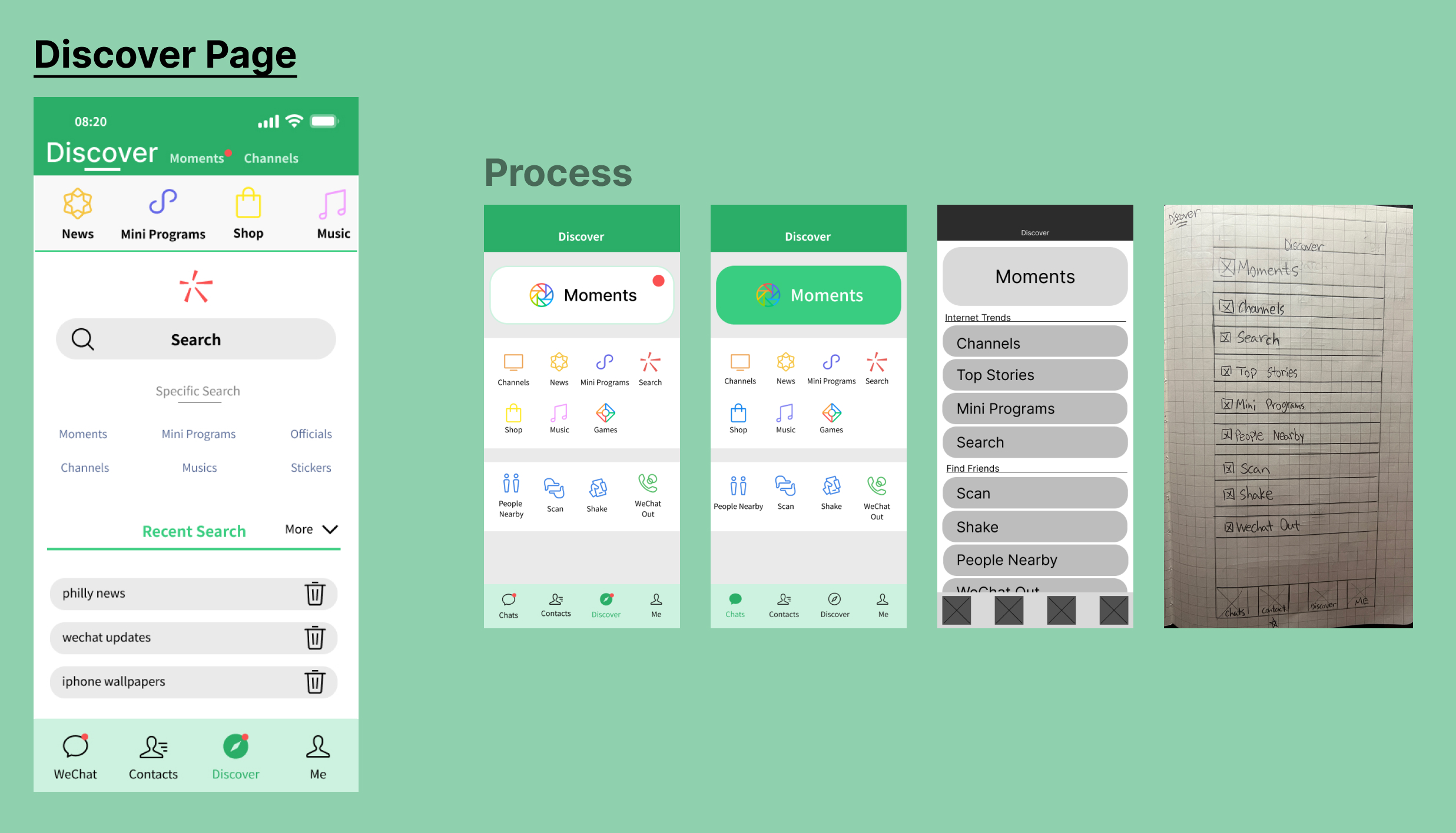
Discover Page
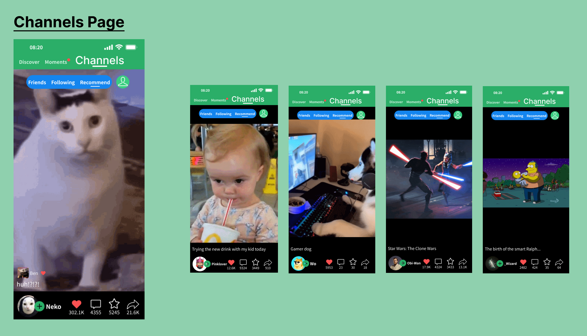
The original Discover page is about the same but has easier navigation. Rather than just one page, I divided it into three different sections: the Discover section, which is mainly for searching; the Moments section, which is the popular page users navigate to often; and the Channels section, which features short videos posted by others.
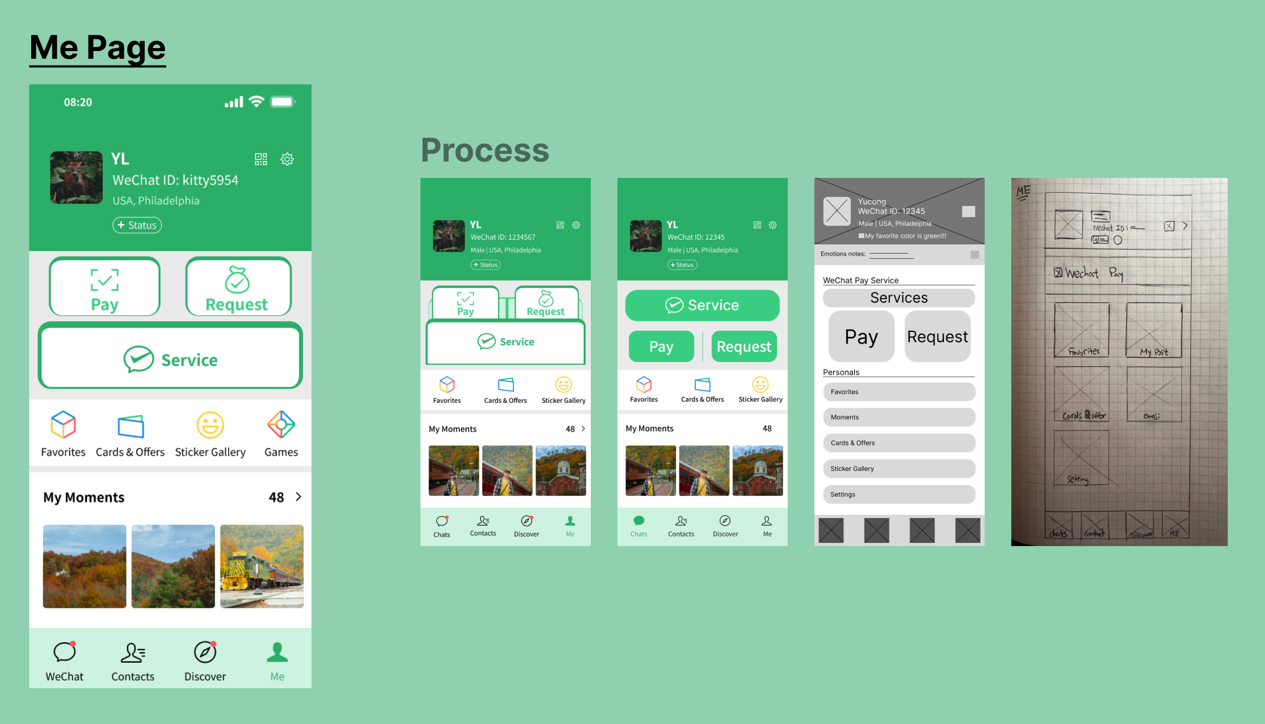
Me Page
WeChat is also known for its WeChat Pay, which is widely used for daily purchases in China. It is the second most important feature of the app. It’s crucial for users to instantly notice and access it when they need to navigate to it during purchases.
For the Me page, I added a simple set of three buttons to make purchases easier. I also included a My Moments section so users can view the Moments they have posted previously. This redesign feels more connected to WeChat’s green identity, enhancing brand recognition. The use of green, especially in relation to WeChat Pay, helps create a sense of comfort and trust, as the color resonates with the idea of money and reliability, extending the app's purpose beyond just being social software.