WeChat
Mobile UIUX
Work
Discover / Define
WeChat’s UI/UX is designed to integrate its social and payment features seamlessly. The social software aspect focuses on a clean, minimalist design for easy navigation and engaging features like Moments Page. The WeChat Pay interface emphasizes trust, simplicity, and quick access, with clear payment options and green accents for reliability. This dual approach ensures a cohesive and user-friendly experience for both communication and financial transactions.
WeChat has become a very popular social software app in China, with nearly everyone using it. Not only is it used for communication, but it also features a payment system called WeChat Pay. Besides communication, the Moments page allows people to post photos and share joyful moments with others. The redesign aims to ensure these features are easier to navigate.
Identity / Deliver
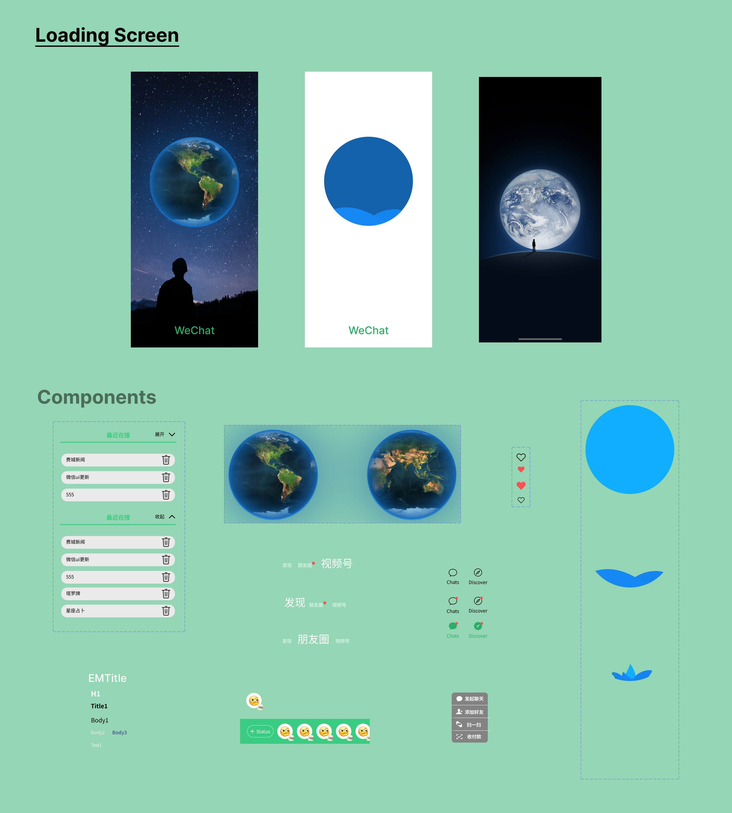
Design Mission:
The original mobile app design for WeChat features a basic white and black theme with limited use of green on the platform. This design lacks a strong identity for WeChat, and navigation requires users to go through multiple buttons, making it less user friendly, especially when accessing popular pages within the app.
WeChat's UX/UI redesign focuses on creating a clean, intuitive interface that seamlessly integrates its diverse features. The redesigned interface emphasizes simplicity, utilizing a clean and uncluttered layout that allows users to easily navigate through various features. The green and white theme enhances brand recognition while keeping the interface visually appealing and organized.
Color Palette
WeChat’s main color, green (#2AAE67), makes the app easy to recognize and represents growth, trust, health, and connection. Black (#000000) is used for important text because it is easy to read, while gray (#C6C6C6) is used for secondary information like placeholders and dividers to create a clear visual hierarchy. White (#FFFFFF) serves as the main background color, keeping the interface clean, simple, and focused on content such as messages and social posts.
Page Designs
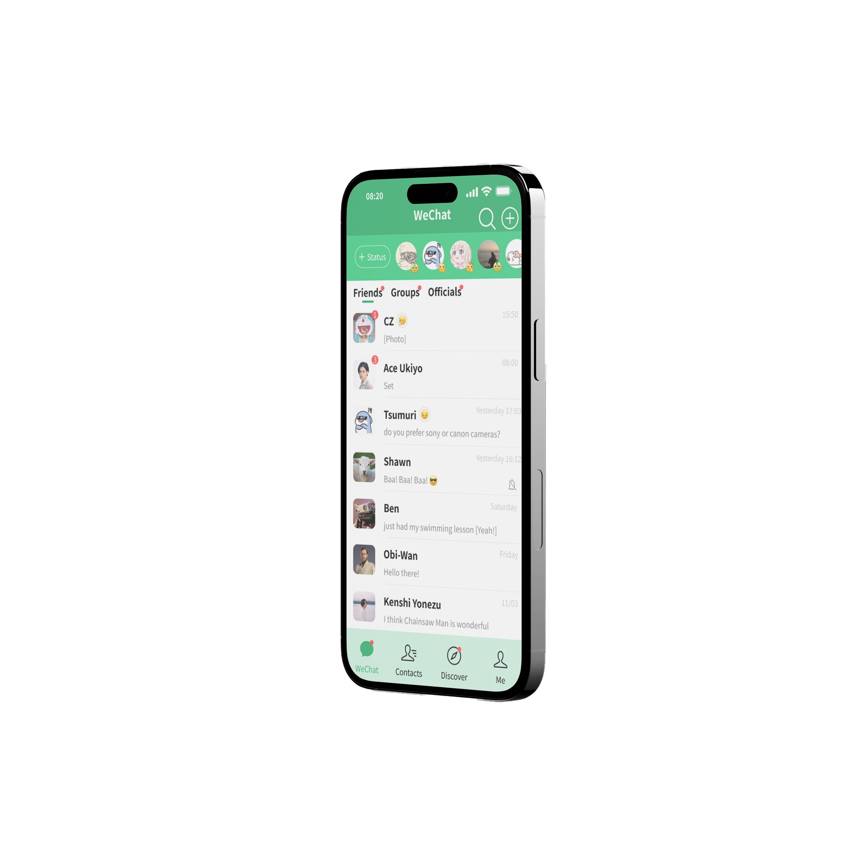
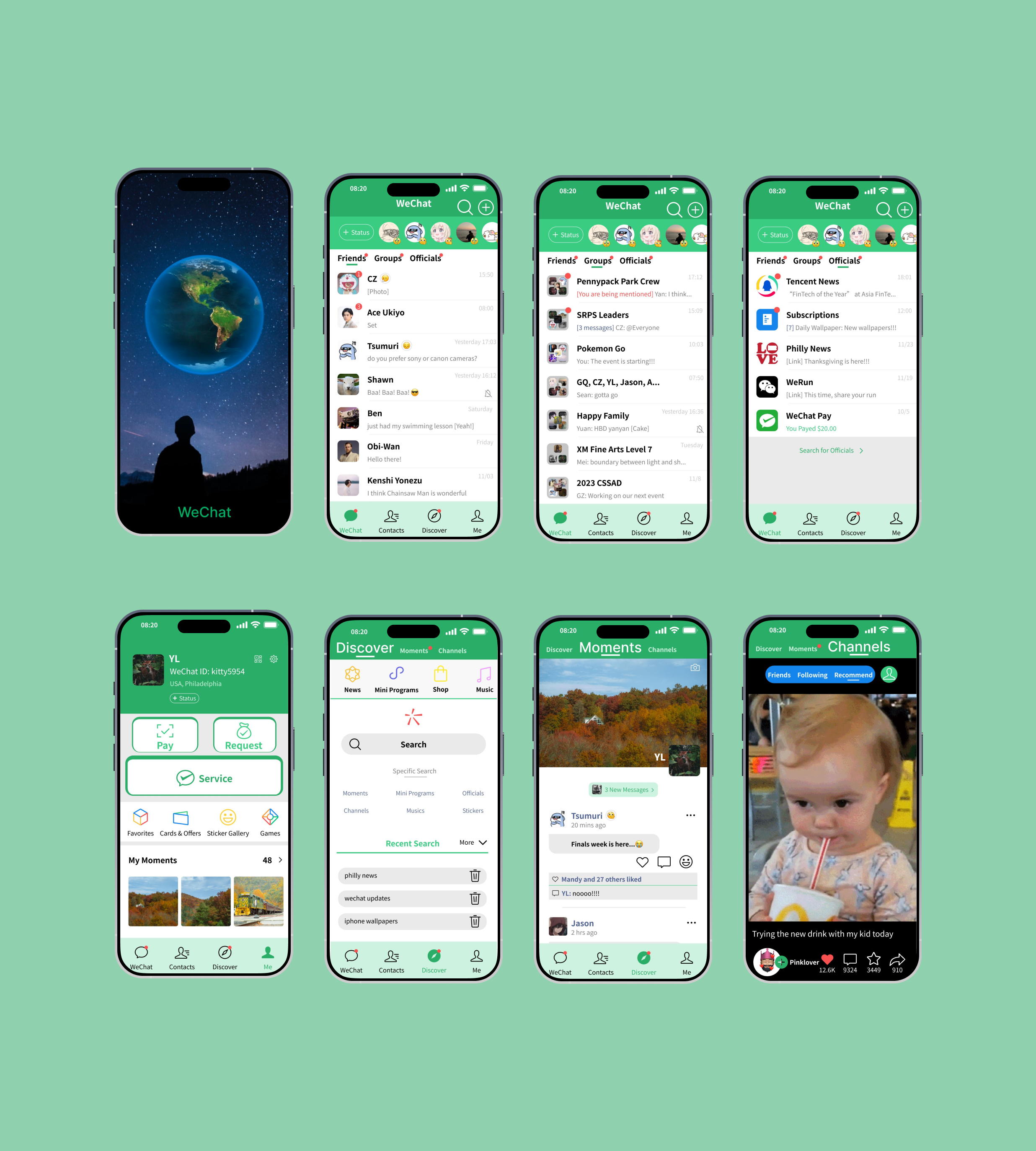
During the low-fidelity wireframes, I explored adding a daily emotion feature to the Home/Chat page. In the original design, emotions are only visible on the Me page, meaning friends must visit a profile to see them. The redesign brings this feature to the top of the Home page with a horizontal scroll that displays users’ avatars and emotions. Tapping an emotion opens a larger view with images, stories, and text.
The Discover page was also redesigned for easier navigation by dividing it into three sections: Discover for searching, Moments for social posts, and Channels for short videos. Since WeChat Pay is one of the app’s most important features and widely used for daily purchases in China, it is given greater visibility so users can access it quickly when needed.
For the Me page, I added three simple action buttons to make purchases more convenient and included a My Moments section where users can easily view their previous posts. Overall, the redesign strengthens WeChat’s green brand identity, improving recognition while creating a greater sense of trust and reliability, especially around WeChat Pay.